

Made with :heart: by Xmartlabs team. XLPagerTabStrip for SwiftUI!
Introduction
PagerTabStripView is the first pager view built in pure SwiftUI. It provides a component to create interactive pager views which contains child views. It allows the user to switch between your views either by swiping or tapping a tab bar item.
 |
 |
 |
 |
|---|
Unlike Apple's TabView it provides:
- Flexible way to fully customize pager tab views.
- Each pagerTabItem view can be of different type.
- Bar that contains pager tab item is placed on top.
- Indicator view indicates selected child view.
- Ability to update pagerTabItem according to highlighted, selected, normal state.
- Ability to embed one page within another and not breaking scroll behavior.
- Ability to update UI according page selection and transition progress among pages.
Usage
Creating a page view is super straightforward, you just need to place your custom tab views into a PagerTabStripView view and apply the pagerTabItem modifier to each one to specify its navigation bar tab item.
The tag parameter is the value to identify the tab item. It can be any Hashable value and it must be unique.
import PagerTabStripView

struct MyPagerView: View {

    var body: some View {

        PagerTabStripView() {
            MyFirstView()
                .pagerTabItem(tag: 1) {
                    TitleNavBarItem(title: "Tab 1")
                }
            MySecondView()
                .pagerTabItem(tag: 2) {
                    TitleNavBarItem(title: "Tab 2")
                }
            if User.isLoggedIn {
                MyProfileView()
                    .pagerTabItem(tag: 3) {
                        TitleNavBarItem(title: "Profile")
                    }
            }
        }

    }
}
To specify the initial selected page you can pass the selection init parameter (for it to work properly this value have to be equal to some tag value of the tab items).
struct MyPagerView: View {

    @State var selection = 1

    var body: some View {
        PagerTabStripView(selection: $selection) {
            MyFirstView()
                .pagerTabItem(tag: 1) {
                    TitleNavBarItem(title: "Tab 1")
                }
            ...
            ..
            .
        }
    }
}
As you may've already noticed, everything is SwiftUI code, so you can update the child views according to SwiftUI state objects as shown above with if User.isLoggedIn.
The user can also configure if the swipe action is enable or not (the swipe is based on a drag gesture) and setup what edges have the gesture disabled.
Params:
swipeGestureEnabled: swipe is enabled or not (default is true).edgeSwipeGestureDisabled: is an HorizontalContainerEdge (OptionSet) value where the set could have this options: .left, .right (default is an empty set).
Why is this parameter important?
This parameter is important in the context of the next PagerTabStripView example in MyPagerView2. If the pager is on the first page and the user tries to swipe left, it's posible that the parent view container will be triggered instead of the pager's swipe gesture, since the drag gesture can catch the parent view gesture. The edgeSwipeGestureDisabled paramenter prevents this from happening.
struct MyPagerView2: View {

    @State var selection = 1

    var body: some View {
        PagerTabStripView(edgeSwipeGestureDisabled: .constant([.left]),
			  selection: $selection) {
            MyFirstView()
                .pagerTabItem(tag: 1) {
                    TitleNavBarItem(title: "Tab 1")
                }
            ...
            ..
            .
        }
    }
}
Customizing the pager style
PagerTabStripView provides 5 different ways to display the views, which can be selected and customized using the pagerTabStripViewStyle modifier.
Scrollable style
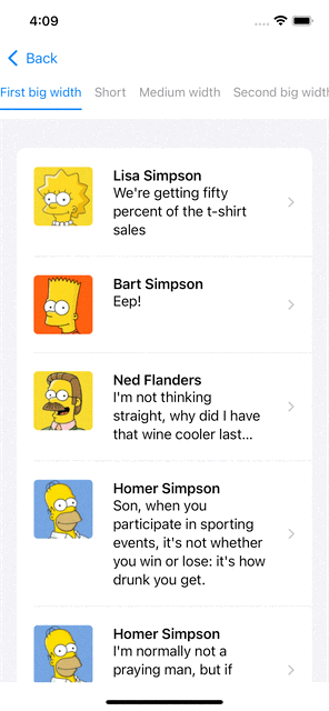
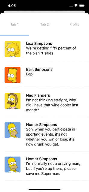
This style allows you to add as many pages as you want. The tabs are placed inside a horizontal scroll for large number of pages.
The customizable settings are:
placedInToolbar: If true TabBar items are placed in the NavigationBar. The pager must be a added inside a NavigationView.pagerAnimationOnTap: Animation used when the selection changes.pagerAnimationOnSwipe: Animation used when the drag gesture changes the transaltion.tabItemSpacing: Horizontal margin between TabBar itemstabItemHeight: Height of the TabBar items continer.padding: Padding of the TabBar items continer.barBackgroundView: Background view of the TabBar items container.indicatorViewHeight: Height of the indicator view.indicatorView: View representing the indicator view.
struct PagerView: View {

    @State var selection = 1

	var body: some View {
		PagerTabStripView(selection: $selection) {
			MyView()
				.pagerTabItem(tag: 1) {
					TitleNavBarItem(title: "First big width")
				}
			AnotherView()
				.pagerTabItem(tag: 2) {
					TitleNavBarItem(title: "Short")
				}
            ...
            ..
            .

		}
        .pagerTabStripViewStyle(.scrollableBarButton(tabItemSpacing: 15,
						     tabItemHeight: 50,
	    					     indicatorView: {
            						Rectangle().fill(.blue).cornerRadius(5)
            					     }))
	}
}
In this example, we add some settings like the tab bar height, indicator view and tab item spaces. Let's see how it looks!
Button bar style
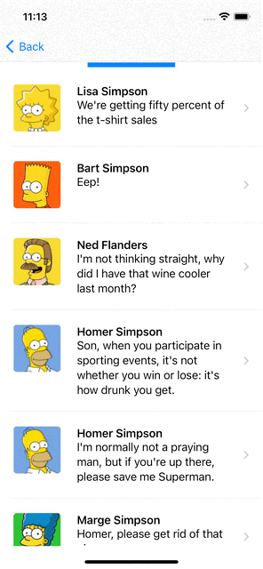
This style places all TabBar items in a container, with each item having the same width. It is ideal for pages with 2-4 pages. The same settings as the Scrollable style can be customized.
The customizable settings are:
placedInToolbar: If true TabBar items are placed in the NavigationBar. Pager must be a added inside a NavigationView.pagerAnimationOnTap: Animation used when selection changes.pagerAnimationOnSwipe: Animation used on drag gesture traslation changes.tabItemSpacing: Horizontal margin among tabbar itemstabItemHeight: TabBar items continer heightpadding: TabBar items continer paddingbarBackgroundView: TabBar items container background view.indicatorViewHeight: Indicator view heightindicatorView: View representing the indicator view.
struct PagerView: View {

    @State var selection = "Tab 1"

	var body: some View {
		PagerTabStripView(selection: $selection) {
			MyView()
				.pagerTabItem(tag: "Tab 1") {
					TitleNavBarItem(title: "Tab 1")
				}
			AnotherView()
				.pagerTabItem(tag: "Tab 2") {
					TitleNavBarItem(title: "Tab 2")
				}
			if User.isLoggedIn {
				ProfileView()
					.pagerTabItem(tag: "Profile") {
						TitleNavBarItem(title: "Profile")
                    }
			}
		}
        .pagerTabStripViewStyle(.barButton(tabItemSpacing: 15,
					   tabItemHeight: 50,
	    			           indicatorView: {
            				   	Rectangle().fill(.gray).cornerRadius(5)
            				   }))
	}
}
In this example, we add some settings like the tab bar height, indicator view and indicator bar height. Let's see how it looks!

Bar style
This style only displays a bar that indicates the current selected page.
The customizable settings are:
placedInToolbar: If set to true, the TabBar items will be placed in the NavigationBar. The Pager must be a added inside a NavigationView.pagerAnimationOnTap: Animation used when the selection changes.pagerAnimationOnSwipe: Animation used when the drag gesture changes the traslation.indicatorViewHeight: Height of the Indicator view.indicatorView: View representing the indicator view.
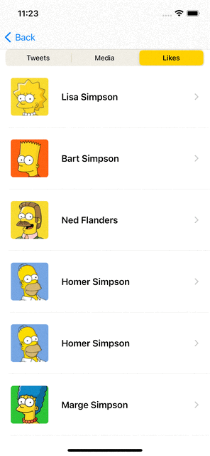
Segmented style
This style uses a Segmented Picker to indicate the selected page. You can indicate the segmented color, its padding and if you want it to be plced inside the toolbar.
The customizable settings are:
placedInToolbar: If true TabBar items are placed in the NavigationBar. The Pager must be a added inside a NavigationView.pagerAnimationOnTap: Animation used when the selection changes.pagerAnimationOnSwipe: Animation used when the drag gesture changes the traslation.backgroundColor: Color of the segmented picker.padding: Padding of the Segmented picker.
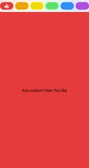
Custom style
We can build any custom styles by using bar and scrollablebar styles and providing custom views representing the indicator and the tabbar container view. Check out the example below. There are some other examples in the Example app.
        .pagerTabStripViewStyle(.barButton(placedInToolbar: false,
                                           pagerAnimation: .interactiveSpring(response: 0.5,
                                                                              dampingFraction: 1.00,
                                                                              blendDuration: 0.25),
                                           tabItemHeight: 48,
                                           barBackgroundView: {
            LinearGradient(
               colors: 🌈,
               startPoint: .topLeading,
               endPoint: .bottomTrailing
           )
           .opacity(0.2)
        }, indicatorView: {
            Text("👍🏻").offset(x: 0, y: -24)
        }))
See how it looks:
Navigation bar
The navigation bar supports custom tab bar views for each page. Ypu can specify each tab bar item inline inside the pagerTabItem modifier or in a independent struct by conforming to a View protocol.
For simplicity, we are going to implement a nav bar item with only a title. You can find more examples in the example app.
struct TitleNavBarItem: View {
    let title: String

    var body: some View {
        VStack {
            Text(title)
                .foregroundColor(Color.gray)
                .font(.subheadline)
        }
        .frame(maxWidth: .infinity, maxHeight: .infinity)
        .background(Color.white)
    }
}

Examples
Follow these 3 steps to run Example project
- Clone PagerTabStripView repo.
- Open PagerTabStripView workspace.
- Run the Example project.
Installation
CocoaPods
To install PagerTabStripView using CocoaPods, simply add the following line to your Podfile:
pod 'PagerTabStripView', '~> 4.0'
Carthage
To install PagerTabStripView using Carthage, simply add the following line to your Cartfile:
github "xmartlabs/PagerTabStripView" ~> 4.0
Requirements
- iOS 16+
- Xcode 14.2+
Author
Getting involved
- If you want to contribute feel free to submit pull requests.
- If you have a feature request please open an issue.
- If you found a bug or need help please check older issues and threads on StackOverflow (Tag 'PagerTabStripView') before submitting an issue.
Before contributing, be sure to check the CONTRIBUTING file for more info.
We'd love to hear about your experience with PagerTabStripView. If you use it in your app, drop us a line on Twitter.
GitHub
| link |
| Stars: 715 |
| Last commit: 24 weeks ago |
Release Notes
- Xcode 14+, iOS 16+ now is required.
- Clean up code by using Swift 5.7 capabilities.
.pagerTabItem(tag: SelectionType)modifier now requires tag parameter which identifies the pager tab item.pagerTabStripViewStyle(_ style: PagerStyle)is the new modifier to set up pager style.- The Selection value indicating the selected page now supports any Hashable value, not just an Int as in the previous version.
- Improved the scroll behavior when the pager is added within another pager or scrollable container. When a child page reaches its edges, the parent scrollable container will scroll. Basically, we added a parameter to disable the edge scroll gesture to trigger the parent gesture.
- Added several complex examples to showcase new functionality.
- The scrollable style page now utilizes the iOS 16 native layout engine through the Layout protocol.
- Fixed the initial animation and position issue of the indicator when presenting the page.
- Resolved errors when reordering, adding, and deleting pages. Now it works perfectly.
public func onPageAppear(perform action: (() -> Void)?) -> some Viewwas removed. You should use onAppear native callback or use selection state variable.- Refactored the enable/disable swipe gesture. Now it's a Binding parameter.
PagerTabViewDelegateandPagerTabViewStatedeleted. You should useselectionstate orpagerSettings.transition.progress(for: tag)to get a notification on selection and scroll progress changes.
Swiftpack is being maintained by Petr Pavlik | @ptrpavlik | @swiftpackco | API | Analytics