UICircularProgressRing
UICircularProgress ring is a library for rendering circular progress rings and timers.
- Declarative: Written using SwiftUI (legacy UIKit version available), UICircularProgressRing is declarative making it easy to read, and easy to use.
- Customizable: Designed to be used in production, all of the views are highly customizable without giving up ease of use. This allows the developer to tailor the look, feel and functionality to fit their needs.
- Tested: Battle tested in many production applications. UICircularProgressRing is also fully unit tested as well as snapshot tested so developers can feel safe.
- Documented: UICircularProgressRing's public API is 100% documented and its something that is enforced before any code is ever added. This is a resource that will help any new user understand how to get the most out of this library.
iOS 14+ Note
Since Apple has now added a built in ProgressView the need for this library is about to be over. My recommendation: If you can support iOS 14.0 and use the new system ProgressView then you should use that. This library will be continued to be maintained (critical bugs will be fixed, etc) but no new features are planned as we are reaching EOL for this library.
Installation
UICircularProgressRing is available in two major versions. The latest version v7.0+ or legacy versions. The legacy version is written using UIKit and requires a deployment target of iOS 8.0+ or tvOS 10.0+. The latest version is written in SwiftUI and requires iOS 13.0+, macOS 15.0+, tvOS 13.0+ or WatchOS 2.0+.
For legacy installation, follow these instructions.
Swift Package Manager
Simply add this library to your package manifest or follow instructions on adding a package dependency using Xcode here.
.package(
    url: "https://github.com/luispadron/UICircularProgressRing.git",
    .branch("master")
)
Documentation
This projects public API is 100% documented and it's something we spend a lot of time working on. Please make sure to read the documentation before opening any issues, questions, etc.
Usage
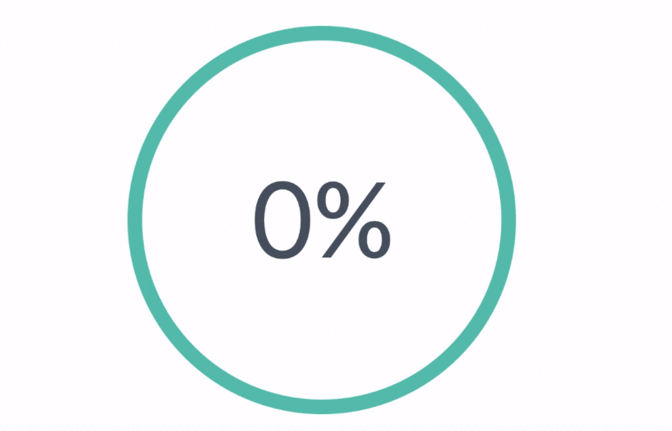
ProgressRing
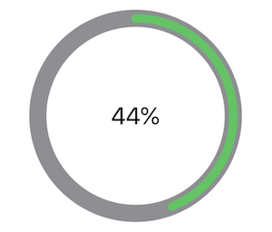
ProgressRing is a view designed to display some kind of progress, this can be anything which is represented as a percentage in the range [0, ∞). A percentage is represented in decimal format, i.e. 0.5 is 50%. Progress may be a downloading operation, the grade percentage of a users test score, etc. A short example of using ProgressRing is shown below, for more details read the docs or play with the example app.
struct ProgressRingExample: View {
    @State var progress = RingProgress.percent(0.44)

    var body: some View {
        VStack {
            ProgressRing(
                progress: $progress,
                axis: .top,
                clockwise: true,
                outerRingStyle: .init(
                    color: .color(.gray),
                    strokeStyle: .init(lineWidth: 20)
                ),
                innerRingStyle: .init(
                    color: .color(.green),
                    strokeStyle: .init(lineWidth: 10),
                    padding: 5
                )
            )
                .animation(.easeInOut(duration: 5))
                .padding(32)
        }
    }
}
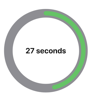
TimerRing
TimerRing is a view designed to display time. You initialize the timer by giving it a unit of time and duration, for example: .seconds(60). This means the TimerRing will run for 60 seconds, filling up the inner ring until finally reaching 100% around the entire outer ring.
A short example of using TimerRing is shown below, for more details read the docs or play with the example app.
struct TimerRingExample: View {
    @State var isPaused = false
    @State var isDone = false

    var body: some View {
        TimerRing(
            time: .minutes(1),
            delay: .seconds(0.5),
            innerRingStyle: .init(
                color: .color(.green),
                strokeStyle: .init(lineWidth: 16),
                padding: 8
            ),
            isPaused: $isTimerPaused,
            isDone: $isTimerDone
        ) { currentTime in
            Text(timeFormatter.string(from: currentTime))
                .font(.title)
                .bold()
        }
    }
}
Examples
Apps Using UICircularProgressRing
- GradePoint by Luis Padron.
- UVI Mate by Alexander Ershov.
- HotelTonight by Hotel Tonight Inc.
- הנתיב המהיר by Elad Hayun
- Nyx Nightclub Management by Nyx Systems IVS
- Barstool Sports by Barstool Sports
- 88 Days by Stijn Kramer
- Bookbot by Bookbot
- car2go by car2go Group GmbH
GitHub
| link |
| Stars: 1718 |
| Last commit: 2 years ago |
Dependencies
Release Notes
Version 7.0.0
- With this version the library gets a complete rewrite.
- Written using SwiftUI.
- Read the README for more info!
Swiftpack is being maintained by Petr Pavlik | @ptrpavlik | @swiftpackco | API | Analytics