SlideOverCard

A SwiftUI card design similar to the one used by Apple in HomeKit, AirPods, Apple Card and AirTag setup, NFC scanning, Wi-Fi password sharing and more. It is specially great for setup interactions.
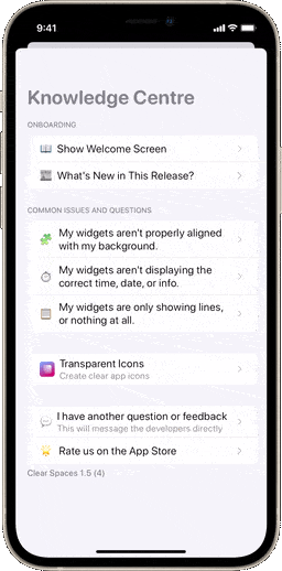
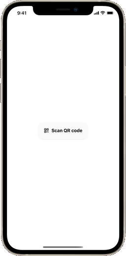
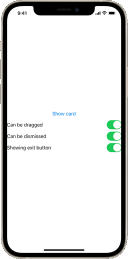
From left to right: SlideOverCard being used in Clear Spaces, a QR code scanner prompt (made with CodeScanner) and a sample demo app
Installation
This repository is a Swift package, so just include it in your Xcode project and target under File > Add package dependencies. Then, import SlideOverCard to the Swift files where you'll be using it.
[!NOTE]
If your app runs on iOS 13, you might find a problem with keyboard responsiveness in your layout. That's caused by a SwiftUI limitation, unfortunately, since theignoresSafeAreamodifier was only introduced for the SwiftUI framework in the iOS 14 update.
Usage
Adding a card to your app is insanely easy. Just add a .slideOverCard() modifier anywhere in your view hierarchy, similarly to a .sheet():
.slideOverCard(isPresented: $isPresented) {
  // Here goes your awesome content
}
And that's it! It just works. In this case, $isPresented is a boolean binding. This way you can dismiss the view anytime by setting it to false.
Extra steps
Customization
The default .slideOverCard() modifier will have a transition, drag and tap controls and a dismiss button set by default. You can override this by manually setting the SOCOptions option set:
// This creates a card that can be dragged, but not dismissed by dragging
.slideOverCard(isPresented: $isPresented, options: [.disableDragToDismiss]) {
}

// This creates a card that can't be dragged nor dismissed by dragging
.slideOverCard(isPresented: $isPresented, options: [.disableDrag, .disableDragToDismiss]) {
}

// This creates a card that can't be dismissed by an outside tap
.slideOverCard(isPresented: $isPresented, options: [.disableTapToDismiss]) {
}

// This creates a card with no dismiss button
.slideOverCard(isPresented: $isPresented, options: [.hideDismissButton]) {
}
If you want to change styling attributes of the card, such as the corner size, the corner style, the inner and outer paddings, the dimming opacity and the shape fill style, such as a gradient, just specify a custom SOCStyle struct.
.slideOverCard(isPresented: $isPresented, style: SOCStyle(cornerRadius: 24.0,
                                                          continuous: false,
                                                          innerPadding: 16.0,
                                                          outerPadding: 4.0,
                                                          dimmingOpacity: 0.1,
                                                          style: .black)) {
}
In case you want to execute code when the view is dismissed (either by the exit button or drag controls), you can also set an optional onDismiss closure parameter:
// This card will print some text when dismissed
.slideOverCard(isPresented: $isPresented, onDismiss: {
    print("I was dismissed.")
}) {
    // Here goes your amazing layout
}
Alternatively, you can add the card using a binding to an optional identifiable object. That will automatically animate the card between screen changes.
// This uses a binding to an optional object in a switch statement
.slideOverCard(item: $activeCard) { item in
    switch item {
        case .welcomeView:
            WelcomeView()
        case .loginView:
            LoginView()
        default:
            ..........
    }
}
Accessory views
This package also includes a few accessory views to enhance your card layout. The first one is the SOCActionButton() button style, which can be applied to any button to give it a default "primary action" look, based on the app's accent color. The SOCAlternativeButton() style will reproduce the same design, but with gray. And SOCEmptyButton() will create a text-only button. You can use them like this:
Button("Do something") {
  ...
}.buttonStyle(SOCActionButton()) // Use the modifier of your choice
There's also the SOCDismissButton() view. This view will create the default dismiss button icon used for the card (based on https://github.com/joogps/ExitButton).
Demo
You can check out a demo project for this package in the demo branch of this repository.
GitHub
| link |
| Stars: 997 |
| Last commit: 2 weeks ago |
Release Notes
🏙️ Use the .background() modifier instead of a ZStack to avoid layout interferences
⚠️ Remove unnecessary deprecated warnings
🛠️ Other minor improvements
Swiftpack is being maintained by Petr Pavlik | @ptrpavlik | @swiftpackco | API | Analytics