SwiftUIToast

A package for displaying sleek iOS-style toast notifications with SwiftUI. It's intended to mimic the toasts seen when charging an Apple Pencil or connecting AirPods.
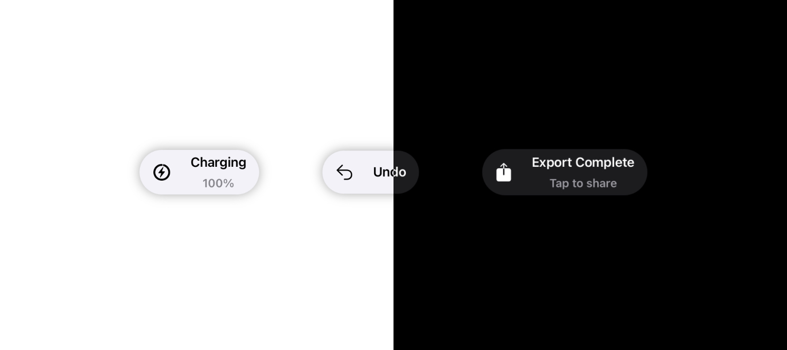
Examples
Setup
Swift Package Manager
SwiftUIToast is a Swift package that can be installed through the 'Package Dependencies' list in your Xcode project. Or, you can add the following line to your own Package.swift file:
dependencies: [
    .package(url: "https://github.com/jebenjamin/SwiftUIToast", from: "1.0.3")
]
CocoaPods
Add the following line to your PodFile:
pod 'SwiftUIToast'
Manually
Drag and drop the SwiftUIToast folder into your project.
Usage
First, you'll need to create a ToastOptions object that holds all the parameters of your Toast. Like so:
let options = ToastOptions(
    title: "Title",
    subtitle: "Subtitle",
    position: .top,
    duration: 5,
    dismissible: true
    )
Next, you can use a ZStack to layer a ToastView on top of the view you want to display a toast for.
ZStack {
    ToastView(options: options)

    Text("Placeholder")
    // and some other views...
}
Once the toast fades out, the view is removed from the hierarchy. The view automatically adapts to the current color scheme (light or dark mode).
Options
image: A SwiftUIImagedisplayed on the left-hand side of the toast. Optional.title: A title string that will be displayed at the top of the toast. Required.subtitle: A subtitle string that will be displayed at the bottom of the toast. Optional.position:.topplaces the toast at the top of the stack,.bottomplaces it at the bottom. Required.duration: The time in seconds to display the ToastView before fading away. Optional. If nil, the ToastView will appear indefinitely.dismissible: If true, the toast will fade away when tapped.
Compatibility
Requires iOS 13.0+ or Mac Catalyst 13.0+.
License
SwiftUIToast uses the MIT license. A copy is available in LICENSE.
GitHub
| link |
| Stars: 1 |
| Last commit: 1 year ago |
Related Packages
Release Notes
This update improves the usage of SwiftUIToast with accessibility features. The title and subtitle are combined into a single accessibility label.
Swiftpack is being maintained by Petr Pavlik | @ptrpavlik | @swiftpackco | API | Analytics