

🕵🏽♂️ Inspector
Inspector is a debugging library written in Swift.


Contents
- Why use it?
- Requirements
- Installation
- Setup
- Presenting the Inspector
- Customization
- Donate
- Credits
- License
Requirements
- iOS 11+
- Xcode 13+
- Swift 5.4+
Why use it?
Improve development experience
- Add your own custom commands to the main
Inspectorinterface and make use of key commands while using the Simulator.app (and also on iPad). - Create layer views by any criteria you choose to help you visualize application state: class, a property, anything.
- Inspect view hierarchy faster then using Xcode's built-in one, or
- Inspect view hierarchy without Xcode.
- Test changes and fix views live.
Improve QA and Designer feedback with a reverse Zeplin
- Inspect view hierarchy without Xcode.
- Test changes and fix views live.
- Easily validate specific state behaviors.
- Better understanding of the inner-workings of components
- Give more accurate feedback for developers.
Installation
Swift Package Manager
The Swift Package Manager is a tool for automating the distribution of Swift code and is integrated into the swift compiler. It is in early development, but Inspector does support its use on supported platforms.
Once you have your Swift package set up, adding Inspector as a dependency is as easy as adding it to the dependencies value of your Package.swift.
// Add to Package.swift

// For projects with iOS 11+ support
dependencies: [
    .package(url: "https://github.com/ipedro/Inspector.git", .upToNextMajor(from: "2.0.0"))
]

// For projects with iOS 14+ support
dependencies: [
    .package(url: "https://github.com/ipedro/Inspector.git", .upToNextMajor(from: "3.0.0"))
]
Setup
After a successful installation, all you need to do is start the Inspector after your app finishes launching in SceneDelegate.swift or AppDelegate.swift. You can optionally add your own custom content, and tweak some configurations.
SceneDelegate.swift
// Scene Delegate Example

import UIKit

// Your application will not be rejected if you include the Inspector framework in your final bundle, however it's recommended that you import it only when debugging.

#if DEBUG
import Inspector
#endif

final class SceneDelegate: UIResponder, UIWindowSceneDelegate {
    var window: UIWindow?

    func scene(_ scene: UIScene, willConnectTo session: UISceneSession, options connectionOptions: UIScene.ConnectionOptions) {
        guard let _ = (scene as? UIWindowScene) else { return }

        (...)

        #if DEBUG
        Inspector.setConfiguration(...) // Optional. Add link to InspectorConfiguration
        Inspector.setCustomization(...) // Optional. Pass an object that conforms to the `InspectorCustomizationProviding` protocol.
        Inspector.start()
        #endif
    }

    (...)
}
AppDelegate.swift
// App Delegate Example

import UIKit

// Your application will not be rejected if you include the Inspector framework in your final bundle, however it's recommended that you import it only when debugging.

#if DEBUG
import Inspector
#endif

final class AppDelegate: UIResponder, UIApplicationDelegate {
    var window: UIWindow?

    func application(_ application: UIApplication, didFinishLaunchingWithOptions launchOptions: [UIApplication.LaunchOptionsKey: Any]?) -> Bool {
        (...)

        #if DEBUG
        Inspector.setConfiguration(...) // Optional. Add link to InspectorConfiguration
        Inspector.setCustomization(...) // Optional. Pass an object that conforms to the `InspectorCustomizationProviding` protocol.
        Inspector.start()
        #endif

        return true
    }

    (...)
}
SwiftUI (Beta)
Please note that SwiftUI support is in early stages and any feedback is welcome.
// Add to your main view, or another view of your choosing

import Inspector
import SwiftUI

struct ContentView: View {
    @State var text = "Hello, world!"
    @State var date = Date()
    @State var isInspecting = false

    var body: some View {
        NavigationView {
            ScrollView {
                VStack(spacing: 15) {
                    DatePicker("Date", selection: $date)
                        .datePickerStyle(GraphicalDatePickerStyle())

                    TextField("text field", text: $text)
                        .textFieldStyle(RoundedBorderTextFieldStyle())
                        .padding()

                    Button("Inspect") {
                        isInspecting.toggle()
                    }
                    .padding()
                }
                .padding(20)
            }
            .inspect(
                isPresented: $isInspecting,
                viewHierarchyLayers: nil,
                elementColorProvider: nil,
                commandGroups: nil,
                elementLibraries: nil
            )
            .navigationTitle("SwiftUI Inspector")
        }
    }
}
Enable Key Commands (Recommended)
Extend the root view controller class to enable Inspector key commands.
// Add to your root view controller.

#if DEBUG
override var keyCommands: [UIKeyCommand]? {
    return Inspector.keyCommands
}
#endif
Remove framework files from release builds (Recommended)
In your app target:
- Add a
New Run Script Phaseas the last phase. - Then paste the script below to remove all
Inspectorrelated files from your release builds.
# Run Script Phase that removes `Inspector` and all its dependecies from release builds.

if [ $CONFIGURATION == "Release" ]; then
    echo "Removing Inspector and dependencies from $TARGET_BUILD_DIR/$FULL_PRODUCT_NAME/"

    find $TARGET_BUILD_DIR/$FULL_PRODUCT_NAME -name "Inspector*" | grep . | xargs rm -rf
    find $TARGET_BUILD_DIR/$FULL_PRODUCT_NAME -name "UIKeyCommandTableView*" | grep . | xargs rm -rf
    find $TARGET_BUILD_DIR/$FULL_PRODUCT_NAME -name "UIKeyboardAnimatable*" | grep . | xargs rm -rf
    find $TARGET_BUILD_DIR/$FULL_PRODUCT_NAME -name "UIKitOptions*" | grep . | xargs rm -rf
    find $TARGET_BUILD_DIR/$FULL_PRODUCT_NAME -name "Coordinator*" | grep . | xargs rm -rf
fi
Presenting the Inspector
The inspector can be presented from any view controller or window instance by calling the presentInspector(animated:_:) method. And that you can achieve in all sorts of creative ways, heres some suggestions.
Using built-in Key Commands (Available on Simulator and iPads)
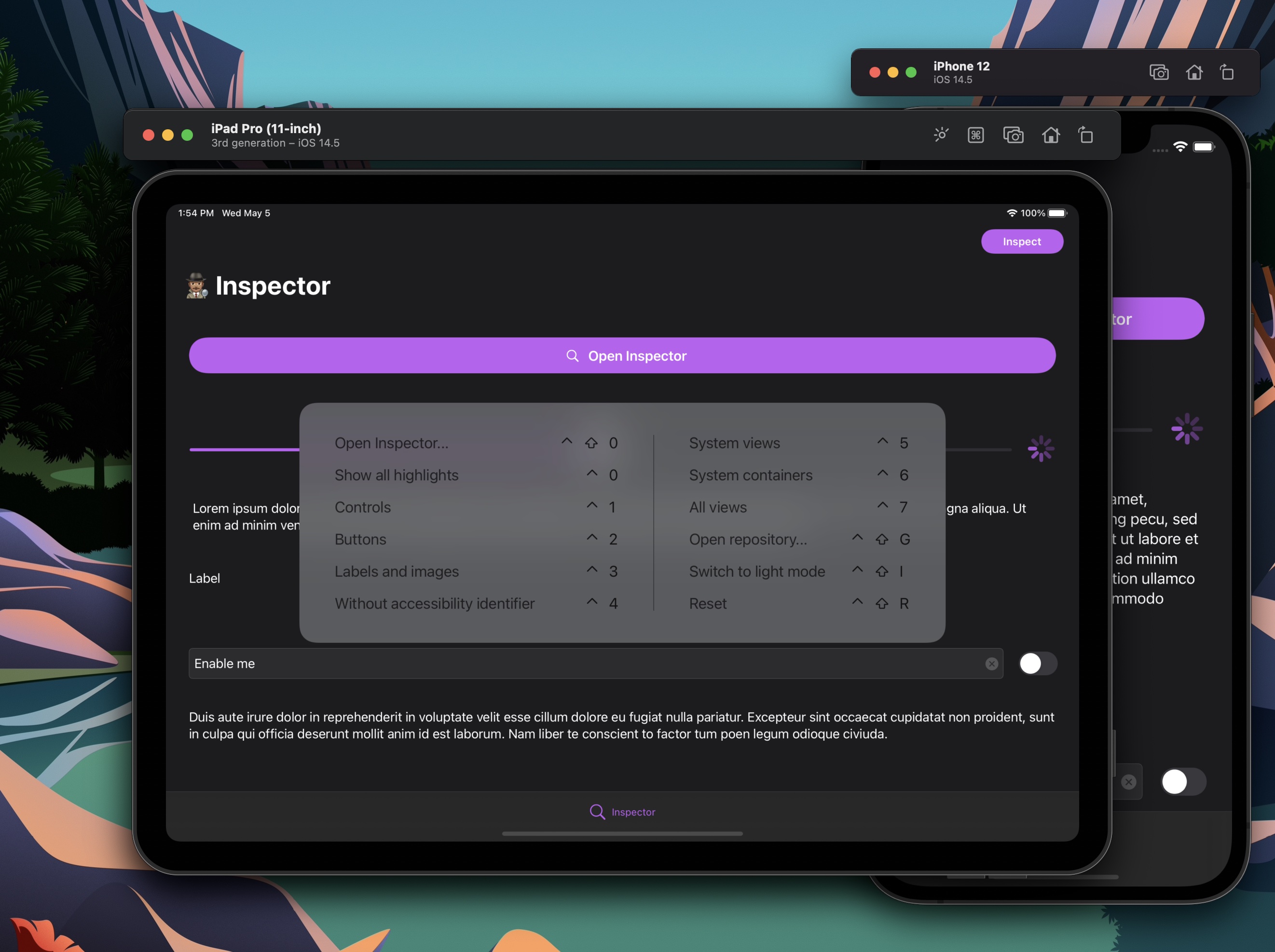
After enabling Key Commands support, using the Simulator.app or a real iPad, you can:
-
Invoke
Inspectorby pressing Ctrl + Shift + 0. -
Toggle between showing/hiding view layers by pressing Ctrl + Shift + 1-8.
-
Showing/hide all layers by pressing Ctrl + Shift + 9.
-
Trigger custom commands with any key command you want.
With motion gestures
You can also present Inspector using a gesture, like shaking the device. That way no UI needs to be introduced. One convienient way to do it is subclassing (or extending) UIWindow with the following code:
// Declare inside a subclass or UIWindow extension.

#if DEBUG
open override func motionBegan(_ motion: UIEvent.EventSubtype, with event: UIEvent?) {
    super.motionBegan(motion, with: event)

    guard motion == .motionShake else { return }

    Inspector.present()
}
#endif
Adding custom UI
After creating a custom interface on your app, such as a floating button, or any other control of your choosing, you can call Inspector.present(animated:) yourself.
// Add to any view controller if your view inherits from `UIControl`

var myControl: MyControl

override func viewDidLoad() {
    super.viewDidLoad()

    myControl.addTarget(self, action: #selector(tap), for: .touchUpInside)
}

@objc
private func tap(_ sender: Any) {
    Inspector.present(animated: true)
}
Customization
Inspector allows you to customize and introduce new behavior on views specific to your codebase, through the InspectorCustomizationProviding Protocol.
InspectorCustomizationProviding Protocol
var elementIconProvider: Inspector.ElementIconProvider? { get }var viewHierarchyLayers: [Inspector.ViewHierarchyLayer]? { get }var elementColorProvider: Inspector.ElementColorProvider? { get }var commandGroups: [Inspector.CommandGroup]? { get }var elementLibraries: [Inspector.ElementPanelType: [InspectorElementLibraryProtocol]] { get }
var viewHierarchyLayers: [Inspector.ViewHierarchyLayer]? { get }
ViewHierarchyLayer are toggleable and shown in the Highlight views section on the Inspector interface, and also can be triggered with Ctrl + Shift + 1 - 8. You can use one of the default ones or create your own.
Default View Hierarchy Layers:
activityIndicators: Shows activity indicator views.buttons: Shows buttons.collectionViews: Shows collection views.containerViews: Shows all container views.controls: Shows all controls.images: Shows all image views.maps: Shows all map views.pickers: Shows all picker views.progressIndicators: Shows all progress indicator views.scrollViews: Shows all scroll views.segmentedControls: Shows all segmented controls.spacerViews: Shows all spacer views.stackViews: Shows all stack views.tableViewCells: Shows all table view cells.collectionViewReusableVies: Shows all collection resusable views.collectionViewCells: Shows all collection view cells.staticTexts: Shows all static texts.switches: Shows all switches.tables: Shows all table views.textFields: Shows all text fields.textViews: Shows all text views.textInputs: Shows all text inputs.webViews: Shows all web views.allViews: Highlights all views.systemContainers: Highlights all system containers.withIdentifier: Highlights views with an accessbility identifier.withoutIdentifier: Highlights views without an accessbility identifier.wireframes: Shows frames of all views.internalViews: Highlights all.
// Example

var viewHierarchyLayers: [Inspector.ViewHierarchyLayer]? {
    [
        .controls,
        .buttons,
        .staticTexts + .images,
        .layer(
            name: "Without accessibility identifiers",
            filter: { element in
                guard let accessibilityIdentifier = element.accessibilityIdentifier?.trimmingCharacters(in: .whitespacesAndNewlines) else {
                    return true
                }
                return accessibilityIdentifier.isEmpty
            }
        )
    ]
}
var elementIconProvider: Inspector.ElementIconProvider? { get }
Return your own icons for custom classes or override exsiting ones. Preferred size is 32 x 32
// Example

var elementIconProvider: Inspector.ElementIconProvider? {
    .init { view in
        switch view {
        case is MyView:
            return UIImage(named: "my-view-icon-32")

        default:
            // you can alwayws fallback to default icons
            return nil
        }
    }
}
var elementColorProvider: Inspector.ElementColorProvider? { get }
Return your own color scheme for the hierarchy label colors, instead of (or to extend) the default color scheme.
// Example

var elementColorProvider: Inspector.ElementColorProvider? {
    .init { view in
        switch view {
        case is MyView:
            return .systemPink

        default:
            // you can alwayws fallback to default color scheme if needed
            return nil
        }
    }
}
var commandGroups: [Inspector.CommandGroup]? { get }
Command groups appear as sections on the main Inspector UI and can have key command shortcuts associated with them, you can have as many groups, with as many commands as you want.
// Example

var commandGroups: [Inspector.CommandGroup]? {
    guard let window = window else { return [] }

    [
        .group(
            commands: [
                .command(
                    title: "Reset",
                    icon: .exampleCommandIcon,
                    keyCommand: .control(.shift(.key("r"))),
                    closure: {
                        // Instantiates a new initial view controller on a Storyboard application.
                        let storyboard = UIStoryboard(name: "Main", bundle: nil)
                        let vc = storyboard.instantiateInitialViewController()

                        // set new instance as the root view controller
                        window.rootViewController = vc

                        // restart inspector
                        Inspector.restart()
                    }
                )
            ]
        )
    ]
}
var elementLibraries: [Inspector.ElementPanelType: [InspectorElementLibraryProtocol]] { get }
Element Libraries are entities that conform to InspectorElementLibraryProtocol and are each tied to a unique type. Pro-tip: Use enumerations.
// Example

var elementLibraries: [Inspector.ElementPanelType: [InspectorElementLibraryProtocol]] {
    [.attributes: ExampleElementLibrary.allCases]
}
// Element Library Example

import UIKit
import Inspector

enum ExampleAttributesLibrary: InspectorElementLibraryProtocol, CaseIterable {
    case roundedButton

    var targetClass: AnyClass {
        switch self {
        case .roundedButton:
            return RoundedButton.self
        }
    }

    func sections(for object: NSObject) -> InspectorElementSections {
        switch self {
        case .roundedButton:
            return .init(with: RoundedButtonAttributesSectionDataSource(with: object))
        }
    }
}
// Element Section Data Source

#if DEBUG
import UIKit
import Inspector

final class RoundedButtonAttributesSectionDataSource: InspectorElementSectionDataSource {
    var state: InspectorElementSectionState = .collapsed

    var title: String = "Rounded Button"

    let roundedButton: RoundedButton

    init?(with object: NSObject) {
        guard let roundedButton = object as? RoundedButton else {
            return nil
        }
        self.roundedButton = roundedButton
    }

    enum Properties: String, CaseIterable {
        case animateOnTouch = "Animate On Touch"
        case cornerRadius = "Round Corners"
        case backgroundColor = "Background Color"
    }

    var properties: [InspectorElementProperty] {
        Properties.allCases.map { property in
            switch property {
            case .animateOnTouch:
                return .switch(
                    title: property.rawValue,
                    isOn: { self.roundedButton.animateOnTouch }
                ) { animateOnTouch in
                    self.roundedButton.animateOnTouch = animateOnTouch
                }

            case .cornerRadius:
                return .switch(
                    title: property.rawValue,
                    isOn: { self.roundedButton.roundCorners }
                ) { roundCorners in
                    self.roundedButton.roundCorners = roundCorners
                }

            case .backgroundColor:
                return .colorPicker(
                    title: property.rawValue,
                    color: { self.roundedButton.backgroundColor }
                ) { newBackgroundColor in
                    self.roundedButton.backgroundColor = newBackgroundColor
                }
            }
        }
    }
}

#endif
Donate
You can support development with PayPal.

Credits
Inspector is owned and maintained by Pedro Almeida. You can follow him on Twitter at @ipedro for project updates and releases.
License
Inspector is released under the MIT license. See LICENSE for details.
GitHub
| link |
| Stars: 154 |
| Last commit: 18 weeks ago |
Dependencies
Swiftpack is being maintained by Petr Pavlik | @ptrpavlik | @swiftpackco | API | Analytics