SearchBarNavigation
A SwiftUI implementation of a UINavigationController with a search bar & search controller. Currently only tried out on iOS, requires iOS 14 upwards.
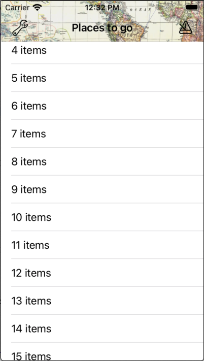
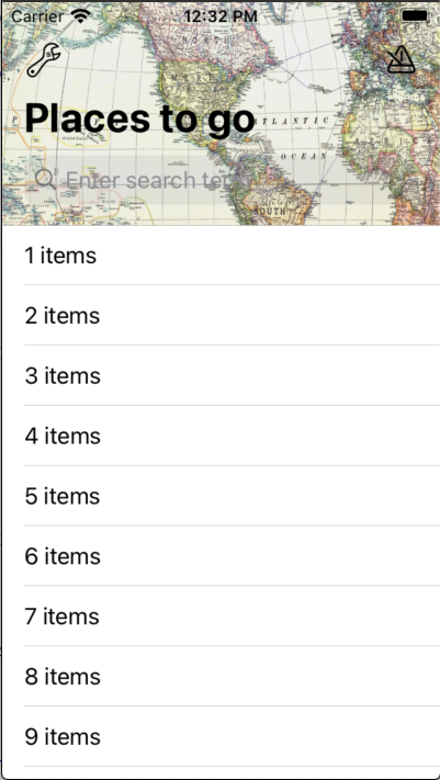
Ignore the odd content of the example images, they're just to show how it works.
Installation
Swift Package Manager
In Xcode:
- File ⭢ Swift Packages ⭢ Add Package Dependency...
- Use the URL https://github.com/franklynw/SearchBarNavigation
Example
NB: All examples require
import SearchBarNavigationat the top of the source file
To use SearchBarNavigation, your viewModel must implement SearchBarShowing. The only required field for the implementation is the searchResults, and you must set the SearchListItemType typealias.
This example is using a custom content type, so it can display icons as well as the search text -
class MainViewModel: SearchBarShowing {

    typealias SearchListItemType = SearchItem

    @Published var searchResults = SearchResults<SearchItemInfo>()

    private var recentsResults = [SearchItemInfo](https://raw.github.com/franklynw/SearchBarNavigation/develop/)

    private var _searchTerm: String = ""
    var searchTerm: Binding<String> {
        Binding<String>(
            get: { self._searchTerm },
            set: {

                self._searchTerm = $0

                if self._searchTerm.isEmpty {
                    self.searchResults.updateSection(withIdentifier: "whatWeFound", withNewContent: [])
                } else {
                    self.searchResults.updateSection(withIdentifier: "recents", withNewContent: recentsResults)
                    self.fetchSearchResults(using: self._searchTerm) { [weak self] in
                        self?.searchResults.updateSection(withIdentifier: "whatWeFound", withNewContent: $0)
                    }
                }
            }
        )
    }

    init() {
        searchResults = initializeSearchResults()
    }

    private func initializeSearchResults() -> SearchResults<SearchItemInfo> {

        var sections = [SearchResultsSection<SearchItemInfo>](https://raw.github.com/franklynw/SearchBarNavigation/develop/)

        let viewConfig: SearchResultsSection<SearchItemInfo>.ViewConfig = .init(resultsEmptyView: someViewForEmptyResults())

        let whatWeFoundSection = SearchResultsSection<SearchItemInfo>(id: "whatWeFound", title: "What we found:", results: [], viewConfig: viewConfig)
        sections.append(whatWeFoundSection)

        let recentsSection = SearchResultsSection<SearchItemInfo>(id: "recents", header: .init(title: "Recently viewed:", button: .init(title: "Clear recents", action: clearRecents)), results: [], viewConfig: viewConfig)
        sections.append(recentsSection)

        return SearchResults(sections)
    }
}


struct MainView: View {

    @ObservedObject private var viewModel: MainViewModel


    init(viewModel: MainViewModel) {
        self.viewModel = viewModel
    }

    var body: some View {

        SearchBarNavigation(viewModel) {
            // page content here
        }
        .navigationBarStyle(.withColorAndImage(textColor: .black, backgroundColor: Color(.myPaleMapColor), image: UIImage(named: "Map")!))
        .placeHolder("Search for somewhere")
    }
}

struct SearchItem: View, SearchBarListItem {

    private let content: SearchItemInfo
    private let textColor: Color

    init(parentViewModel: RecipesViewModel, content: SearchItemInfo, textColor: Color?, backgroundColor: Color?, select: ((String) -> ())?) {
        self.content = content
        self.textColor = textColor ?? Color(.label)
    }

    var body: some View {
        HStack {
            Text(content.name)
                .foregroundColor(textColor)
            Spacer()
            Image(systemName: content.systemImageName)
        }
    }
}

struct SearchItemInfo {
    let name: String
    let systemImageName: String

    init(_ name: String, _ systemImageName: String) {
        self.name = name
        self.systemImageName = systemImageName
    }
}
Available modifiers -
NavigationBar style
You can set the style attributes using a NavigationBarStyle value to customise things such as title colour & background colour or image.
SearchBarNavigation(viewModel)
    .navigationBarStyle(.colored(textColor: .purple, backgroundColor: .pink))
or
SearchBarNavigation(viewModel)
    .navigationBarStyle(.withColorAndImage(textColor: .blue, backgroundColor: .yellow, image: myNavBarImage))
Disable large titles
It defaults to using large titles, but you can disable that.
SearchBarNavigation(viewModel)
    .disableLargeTitles
Translucent background
Set this so you can see the content below the navigation bar. Note that if you set a background colour for the bar, unless that colour has an alpha component of less than 1, the bar will appear opaque.
SearchBarNavigation(viewModel)
    .translucentBackground
Placeholder
You can set the search field's placeholder text.
SearchBarNavigation(viewModel)
    .placeHolder("Search for something")
SearchScope titles
You can show a search scope control below the searchBar textField, which is configured with this modifier.
SearchBarNavigation(viewModel)
    .searchScopeTitles(["Title", "Keywords"])
Bar buttons
You can set the bar buttons, either with normal buttons or with menu buttons (they show a menu when you tap them). This is controlled by the type of ButtonConfig you provide.
SearchBarNavigation(viewModel)
    .barButtons(viewModel.barButtons())
SearchBar textField button
You can set the left view of the searchBar textField to a button.
SearchBarNavigation(viewModel)
    .searchFieldButton(someSearchFieldButton)
SearchBar inputAccessoryView
You can show an inputAccessoryView above the keyboard, and configure it with various options using the SearchInputAccessory enum.
SearchBarNavigation(viewModel)
    .searchInputAccessory(someInputAccessory)
The SearchView background colour
Set the (global) background colour for the whole search results view - this will be overridden if you provide a backgroundColor in the ViewConfig in the searchResults section.
SearchBarNavigation(viewModel)
    .searchViewBackgroundColor(Color(.lightGray))
The search results headers colour
Set the (global) colour of the headers for the results sections - this will be overridden if you provide a headerColor in the ViewConfig in the searchResults section.
SearchBarNavigation(viewModel)
    .searchResultsHeadersColor(Color(.darkGray))
The search results text colour
Set the (global) colour of the text in the search results view - this will be overridden if you provide a textColor in the ViewConfig in the searchResults section.
SearchBarNavigation(viewModel)
    .searchResultsTextColor(Color(.darkText))
Cancel button colour
The colour to use for the Cancel button - defaults to Color(.link) if unused.
SearchBarNavigation(viewModel)
    .cancelButtonColor(.red)
Additional action if a search result item is selected
You can specify further actions to be invoked if an item is selected.
SearchBarNavigation(viewModel)
    .itemSelected { itemName in
        // do something
    }
Show last results on activate
If you use this modifier, then previous results will be displayed before any new search is triggered
SearchBarNavigation(viewModel)
    .showLastResultsOnActivate
Cancel search when tapping the keyboard dismiss button
When you tap the keyboard dismiss button in the inputAccessoryView (if configured), the default behaviour is to NOT cancel the search screen, but to leave all the results showing. You can override this behaviour with this modifier -
SearchBarNavigation(viewModel)
    .cancelSearchOnKeyboardDismiss
Disable animations when the search results change
The default behaviour is to animate resutls changes. Disable this using the modifier -
SearchBarNavigation(viewModel)
    .disableResultsChangedAnimations
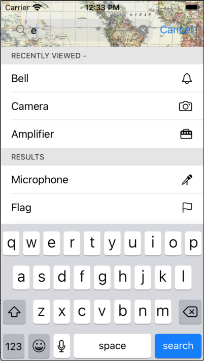
SearchResults & SearchResultsSection
These are the structs you use to contain the search results. The SearchResults contains SearchResultsSection items - one section for each kind, eg, one for recents, another for server, etc.
The SearchResults can be initialised with an empty initialiser - init() - or with sections -
init(_ sections: [SearchResultsSection<Content>])
When the searchResults var is updated, the search results content will update automatically.
The SearchResultsSection has two initialisers, each requires an array of results -
public init(id: String, title: String, results: [Content], maxShown: Int, viewConfig: ViewConfig?)
or
public init(id: String, header: Header, results: [Content], maxShown: Int, viewConfig: ViewConfig?)
- The optional id parameter allows you to update content using that id to reference the section.
- The maximum number of rows to show defaults to unlimited if unused.
- The second intialiser allows more customisation of the section header, via the Header struct.
- The ViewConfig struct is self-explanatory, & allows you to customise the appearance of the results. Although you specify the customisation, it is up to you to implement it in the search results items' views.
For setting and updating your search results, the SearchResultsSection provides the following -
- Replace the content in a section
mutating func updateSection(withIdentifier identifier: String, withNewContent content: [Content])
- Append the content in a section
mutating func appendSection(withIdentifier identifier: String, withAdditionContent content: [Content])
- You can also get a section from the search results -
func section(forIdentifier identifier: String) -> SearchResultsSection<Content>?
- Clear the content from a section -
mutating func clearSections(withIdentifiers identifiers: [String]?)
SearchResultsSection.ViewConfig
public init(textColor: Color?, backgroundColor: Color?, resultsEmptyView: (() -> AnyView)?)
The resultsEmptyView parameter allows you to provide custom views in the event of no results being returned.
SearchResultsSection.Header
init(title: String, color: Color?, textColor: Color?, button: Button?)
You can set its text & background colours, and add a button (which will appear in the right of the header).
NavigationBarStyle
An enum for configuring the navigation bar style. The options are -
- coloured - lets you specify text and background colours.
.colored(textColor: Color, backgroundColor: Color)
- withImage - lets you specify a background image for the navigation bar, plus text colour.
.withImage(textColor: Color, image: UIImage)
- withColorAndImage - lets you specify both a background colour and image (in the event of you having an image with an alpha channel), plus the text colour.
.withColorAndImage(textColor: Color, backgroundColor: Color, image: UIImage)
BarButtons
This is the struct to use for configuring the navigation bar buttons. The initialiser allows you to specify leading & trailing buttons, and the button colour.
init(leading: [BarButton] = [], trailing: [BarButton] = [], color: Color? = nil)
BarButton
The BarButton enum is for specifying the type of the button - a standard action button (using ImageButtonConfig) or a menu button (using BarMenuButton).
BarMenuButton
Struct for configuring a menu button, using the FWMenu component. The initialisers require you to provide a closure which returns an array of FWMenuSection items, plus some other customisation options.
SearchInputAccessory
This is the enum which allows you to configure an inputAccessoryView for the search bar. The options are -
- .buttons - you can specify an array of buttonConfigs for leading & trailing buttons, plus optional configuration for the keyboard dismiss button and the bar background colour.
.buttons(leading: [ImageButtonConfig] = [], trailing: [ImageButtonConfig] = [], keyboardDismissButtonConfig: ImageButtonConfig? = nil, backgroundColor: Color? = nil)
- .title - you can specify a title, plus optional configuration for the keyboard dismiss button and the bar background colour.
.title(FWMenuItem.Title, keyboardDismissButton: ImageButtonConfig? = nil, backgroundColor: Color? = nil)
- .textWithButton - you provide a text publisher which will update the description field in the bar (for instance, if the button you provide shows a menu which causes the description to change), and a buttonConfig, plus optional configuration for the keyboard dismiss button and the bar background colour.
.textWithButton(text: Published<String>.Publisher, buttonConfig: ImageButtonConfig, keyboardDismissButtonConfig: ImageButtonConfig? = nil, backgroundColor: Color? = nil)
PlainNavigation
There is also a PlainNavigation view, which offers the same customisation options as SearchBarNavigation, minus the search stuff. This seems to work properly in a number of places where the Apple SwiftUI Navigation doesn't, plus it's easily customisable.
Dependencies
- Requires FWMenu, which is linked. GitHub page is here
- Requires ButtonConfig, which is linked. GitHub page is here
- Requires FWCommonProtocols, which is linked. GitHub page is here
Issues
It all seems to work well, but there are probably still bugs... If anyone can suggest a better way of doing what I've done for the navBar background image (in NavigationConfiguring - setBackgroundImage) I'd really like to hear!
Licence
SearchBarNavigation is available under the MIT licence.
GitHub
| link |
| Stars: 1 |
| Last commit: 18 hours ago |
Swiftpack is being maintained by Petr Pavlik | @ptrpavlik | @swiftpackco | API | Analytics