


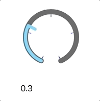
Knob
Simple slider-like control that depicts its path as an arc using CoreAnimation layers. Supports both iOS and macOS platforms.
 |
 |
Like a slider, touch movements in the control change the value. For this implementation:
- Only vertical movements change the value. Moving up will increase the value, moving down will decrease it. Simple.
- By default, touch sensitivity is set to 1x the height of the knob -- a touch moving 1x the height would
change the value from 0.0 to 1.0. See the documentation for the
touchSensitivityparameter. - Touch sensitivity can be decreased by moving the touch horizontally away from the control (either direction). This is similar to the change in "scrubbing" speed when watching a video -- the further the touch moves away from the scrubber, the finer the positioning is within the video (larger movements for same amount of change in value)
- For now, this control reports value changes continuously -- there is no way to disable this as there is for a UISlider.
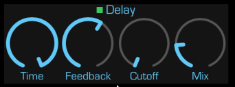
The above picture was taken from my SoundFonts iOS app where the knobs control various audio effects settings.
Included is a playground for playing with a knob.
Versions
There are two major versions that have a slight change in the API. Originally (up to v1.6.0) the width of the knob's track and indicator were given as notional pixel values. With v2.0.0, this changed to factor which is multiplied with the minimum of the bounds width and height values to arrive at the width value to use. This allows for scaling of the knob features as the bounds of the knob changes.
- old-style track/indicator width values -- use version v1.6.0
- new-style track/indicator scaling factor values -- use version v2.x.y
Configuration
minimumValue-- the lowest value that the control will report out.maximumValue-- the highest value that the control will report out.value-- the current value of the control (settable).travelDistance-- the number of pixels to use in mouse/touch event distance calculations. By default this is the smaller of the frame width/height.touchSensitivity-- scaling factor between touch movement and value change. The default is1which means that one must drag 1xtravelDistancein order to change the value frommiminimumValuetomaximumValue; a value of2would require 2xtravelDistance.maxChangeRegionWidthPercentage-- percentage oftravelDistancethat will always produce maximum value change. This defines a vertical region in the center of the view. Mouse/touch events outside of this region will have increased sensitivity as the event X is further from the view center X, requiring more movement for the same change in value.trackWidthFactor-- the line width of the knob's arc that appears as a track for the progress indicator. This is multiplied by the min width/height bounds value. Allows for scaling of the knob as the size increases.trackColor-- the color of the arc that is drawn from the current value to the end.progressWidthFactor-- the line width of the knob's arc that is drawn from the start to the current value. This is multipled by the min width/height bounds value. Allows for scaling of the knob as the size increases.progressColor-- the color of the arc that is drawn from the start to the current value.indicatorWidthFactor-- the line width of the knob's indicator that is draw from the current value towards the knob center. SeeprogressWidthFactor.indicatorColor-- the color of the line that is drawn from the current value to the center.indicatorLineLength-- the amount of the line that is drawn from the current value to the center, where 0.0 indicates no line will be drawn, and 0.5 results in a line that is half-way to the knob center point.startAngle-- the starting point in radians of the arc (see below)endAngle-- the ending point in radians of the arctickCount-- number of ticks to showtickLineLength-- fraction of a radius to draw (0.0 - 1.0)tickLineWidth-- width of the tick linetickColor-- the color of the tick linevalueLabel-- an optional UILabel/NSText to use to show a formatted textual representation of the current value.valueName-- optional name to show in thevalueLabelwhen the knob is not being manipulated. Ifnil, the knob value is always shown.valueFormatter-- optional NumberFormatter to use to generate the textual representation shown in thevalueLabel.valuePersistence-- the number of seconds to persist the last value shown before showing thevalueName(if non-nil). Only applies after the end of a mouse or touch event.
Arc angles are explained well in the UIBezierPath documentation. In brief, an angle of 0 will extend along the X axis, whereas an angle of π/2 will extend along the negative Y axis.
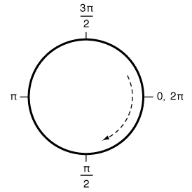
The draw method used to render the knob's arc path draws in a clockwise fashion, so the end arc angle must be greater
than the start arc angle. The default values leave the opening in the arc path centered around the negative Y axis
(pointing down), with an arc distance of 2/16 of the circumference.
Mouse/Touch Tracking
As one would expect, a touch in the knob's view area is tracked and any changes are reported to any registered actions:
- Moving vertically up will increase the knob's value
- Moving vertically down will decrease the knob's value
- Moving horizontally does not affect the value but it does alter the
touchSensitivityvalue that is used to generate updates to the control'svalue, and the further away a touch moves horizontally from the center, the less sensitive the vertical movements become -- one must move larger vertical distances to achieve the same value change.
SwiftUI Support
The package also includes a SwiftUI implementation: KnobView. The defaults should be good enough to start with, but
there are modifiers you can apply to your KnobView to configure the look you want. The KnobView constructor requires
two state bindings, one for the knob's value and another for the knob's manipulating flag. Additionally, you can provide
the minimumValue and maximumValue values to override the defaults of 0.0 and 1.0 respectively.
KnobView(value: $volumeValue, manipulating: $volumeManipulating, minimum: 0.0, maximum: 1.0)
  .trackStyle(width: trackWidth, color: trackColor)
  .progressStyle(width: progressWidth, color: progressColor)
  .indicatorStyle(width: progressWidth, color: progressColor, length: 0.3)
Demo Apps
The KnobDemo folder contains an Xcode project which you can open to build simple demo apps for macOS and iOS
platforms. These also contain UI tests that make sure that the knobs properly track and report out their values.
The demo apps use SwiftUI for their view definitions. They both contain a ContentView properly wires up two KnobView
instances with a Text view that shows the value of a KnobView.
GitHub
| link |
| Stars: 13 |
| Last commit: 3 weeks ago |
Dependencies
Related Packages
Release Notes
Swiftpack is being maintained by Petr Pavlik | @ptrpavlik | @swiftpackco | API | Analytics