Swiftpack.co is a collection of thousands of indexed Swift packages. Search packages.
See all packages published by alokc83.
alokc83/MASegmentedControl 0.0.6
Super customizable segmented control
⭐️ 81
🕓 3 years ago
iOS
.package(url: "https://github.com/alokc83/MASegmentedControl.git", from: "0.0.6")
MASegmentedControl 


Code Quality:
| Service | Grading |
|---|---|
| coderefactor.io | |
| codebeat.co | |
| codecov.io | N/A |
Super customizable Segmented Control for iOS.
Following examples can give you idea how it can be customized. All this customization can be written anywhere before rendering of the control. Most desirable place is didSet block.
For example:
@IBOutlet var imagesSegmentedControl: MASegmentedControl! {
	didSet {
		imagesSegmentedControl.fillEqually = false
 		imagesSegmentedControl.buttonsWithDynamicImages = true
 		imagesSegmentedControl.roundedControl = true
    }
}
Integrating with cococapods:
Integrating latest version
pod 'MASegmentedControl'
Integrating specific version
pods 'MASegmentedControl', '~> 0.0.5'
Integrating with Carthage:
Integrating latest version
github "alokc83/MASegmentedControl"
Integrating specific version
github "alokc83/MASegmentedControl" ~> 0.0.5
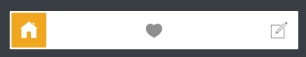
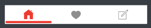
Circular segment:
You would need to provide the image array that can be a array of image litrals or array of UIImage.
 imagesSegmentedControl.fillEqually = false
 imagesSegmentedControl.buttonsWithDynamicImages = true
 imagesSegmentedControl.roundedControl = true

 // images is the array of image litrals
 imagesSegmentedControl.setSegmentedWith(items: images)
 imagesSegmentedControl.padding = 2
 imagesSegmentedControl.thumbViewColor = #colorLiteral(red: 0.9372549057,
 											green: 0.3490196168,
 											blue: 0.1921568662,
 											alpha: 1)
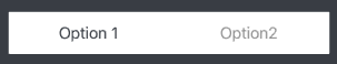
Rounded corner segment:
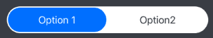
didSet {
        //Set this booleans to adapt control
        textSegmentedControl.itemsWithText = true
        textSegmentedControl.fillEqually = true
        textSegmentedControl.roundedControl = true

        textSegmentedControl.setSegmentedWith(items: ["Option 1", "Option2"])
        textSegmentedControl.padding = 2
        textSegmentedControl.textColor = #colorLiteral(red: 0.2549019754,
     											green: 0.2745098174,
     											blue: 0.3019607961,
    											alpha: 1)
        textSegmentedControl.selectedTextColor = #colorLiteral(red: 1,
        									green: 1,
        									blue: 1,
        									alpha: 1)
        textSegmentedControl.thumbViewColor = #colorLiteral(red: 0,
        										green: 0.4784313725,
        										blue: 1,
      											alpha: 1)
        textSegmentedControl.titlesFont = UIFont(name: "OpenSans-Semibold", size: 14)
}
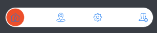
Square design with image:
didSet {
        //Set this booleans to adapt control
        iconsSegmentedControl.itemsWithText = false
        iconsSegmentedControl.fillEqually = false
        iconsSegmentedControl.roundedControl = false

        // icons is the array of image litrals
        iconsSegmentedControl.setSegmentedWith(items: icons)
        iconsSegmentedControl.padding = 2
        iconsSegmentedControl.thumbViewColor = #colorLiteral(red: 0.9529411793, green: 0.6862745285, blue: 0.1333333403, alpha: 1)
        iconsSegmentedControl.buttonColorForNormal = #colorLiteral(red: 0.6000000238, green: 0.6000000238, blue: 0.6000000238, alpha: 1)
        iconsSegmentedControl.buttonColorForSelected = #colorLiteral(red: 1, green: 1, blue: 1, alpha: 1)
  }
Square text design:
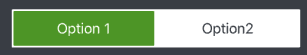
didSet {
        //Set this booleans to adapt control
        textSquareSegmentedControl.itemsWithText = true
        textSquareSegmentedControl.fillEqually = true

        let strings = ContentDataSource.textItems()
        textSquareSegmentedControl.setSegmentedWith(items: strings)
        textSquareSegmentedControl.padding = 2
         textSquareSegmentedControl.textColor = #colorLiteral(red: 0.2549019754, green: 0.2745098174, blue: 0.3019607961, alpha: 1)
        textSquareSegmentedControl.selectedTextColor = #colorLiteral(red: 1, green: 1, blue: 1, alpha: 1)
         textSquareSegmentedControl.thumbViewColor = #colorLiteral(red: 0.3411764801, green: 0.6235294342, blue: 0.1686274558, alpha: 1)
  }
Youtube style design:
didSet {
        //Set this booleans to adapt control
        youtubeLikeSegmentedControl.itemsWithText = false
        youtubeLikeSegmentedControl.bottomLineThumbView = true
        youtubeLikeSegmentedControl.fillEqually = true

        // icons is the array of image litrals
        youtubeLikeSegmentedControl.setSegmentedWith(items: icons)
        youtubeLikeSegmentedControl.padding = 2
        youtubeLikeSegmentedControl.thumbViewColor = #colorLiteral(red: 0.9411764706, green: 0.2549019608, blue: 0.2020437331, alpha: 1)
        youtubeLikeSegmentedControl.buttonColorForNormal =  #colorLiteral(red: 0.6000000238, green: 0.6000000238, blue: 0.6000000238, alpha: 1)
        youtubeLikeSegmentedControl.buttonColorForSelected = #colorLiteral(red: 0.9411764706, green: 0.2549019608, blue: 0.2020437331, alpha: 1)
  }
Simple text highlight design:
didSet {

       //Set this booleans to adapt control
       hiddenThumbViewSegmentedControl.itemsWithText = true
       hiddenThumbViewSegmentedControl.fillEqually = true
       hiddenThumbViewSegmentedControl.thumbViewHidden = true

       hiddenThumbViewSegmentedControl.setSegmentedWith(items: ["Option 1", "Option 2"])
       hiddenThumbViewSegmentedControl.padding = 2
       hiddenThumbViewSegmentedControl.textColor = #colorLiteral(red: 0.6000000238, green: 0.6000000238, blue: 0.6000000238, alpha: 1)
       hiddenThumbViewSegmentedControl.selectedTextColor = #colorLiteral(red: 0.2549019754, green: 0.2745098174, blue: 0.3019607961, alpha: 1)
        }
Simple text highlight with underbar design:
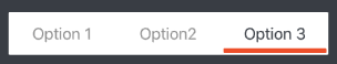
didSet {
        //Set this booleans to adapt control
        linearThumbViewSegmentedControl.itemsWithText = true
        linearThumbViewSegmentedControl.fillEqually = true
        linearThumbViewSegmentedControl.bottomLineThumbView = true

        linearThumbViewSegmentedControl.setSegmentedWith(items: ["Option 1", "Option 2", "Option 3"])
        linearThumbViewSegmentedControl.padding = 2
        linearThumbViewSegmentedControl.textColor = #colorLiteral(red: 0.6000000238, green: 0.6000000238, blue: 0.6000000238, alpha: 1)
        linearThumbViewSegmentedControl.selectedTextColor = #colorLiteral(red: 0.2549019754, green: 0.2745098174, blue: 0.3019607961, alpha: 1)
         linearThumbViewSegmentedControl.thumbViewColor = #colorLiteral(red: 0.9372549057, green: 0.3490196168, blue: 0.1921568662, alpha: 1)
  }

GitHub
| link |
| Stars: 81 |
| Last commit: 30 weeks ago |
Advertisement: IndiePitcher.com - Cold Email Software for Startups
Release Notes
Release 0.0.6
3 years ago
Release Notes
- Long standing issue #8 is fixed.
- Supports SPM
Swiftpack is being maintained by Petr Pavlik | @ptrpavlik | @swiftpackco | API | Analytics