
Popovers
A library to present popovers.
- Present any view above your app's main content.
- Attach to source views or use picture-in-picture positioning.
- Display multiple popovers at the same time with smooth transitions.
- Supports SwiftUI, UIKit, and multitasking windows on iPadOS.
- Highly customizable API that's super simple — just add
.popover. - Drop-in replacement for iOS 14's
Menuthat works on iOS 13. - SwiftUI-based core for a lightweight structure. 0 dependencies.
- It's 2023 — about time that popovers got interesting!
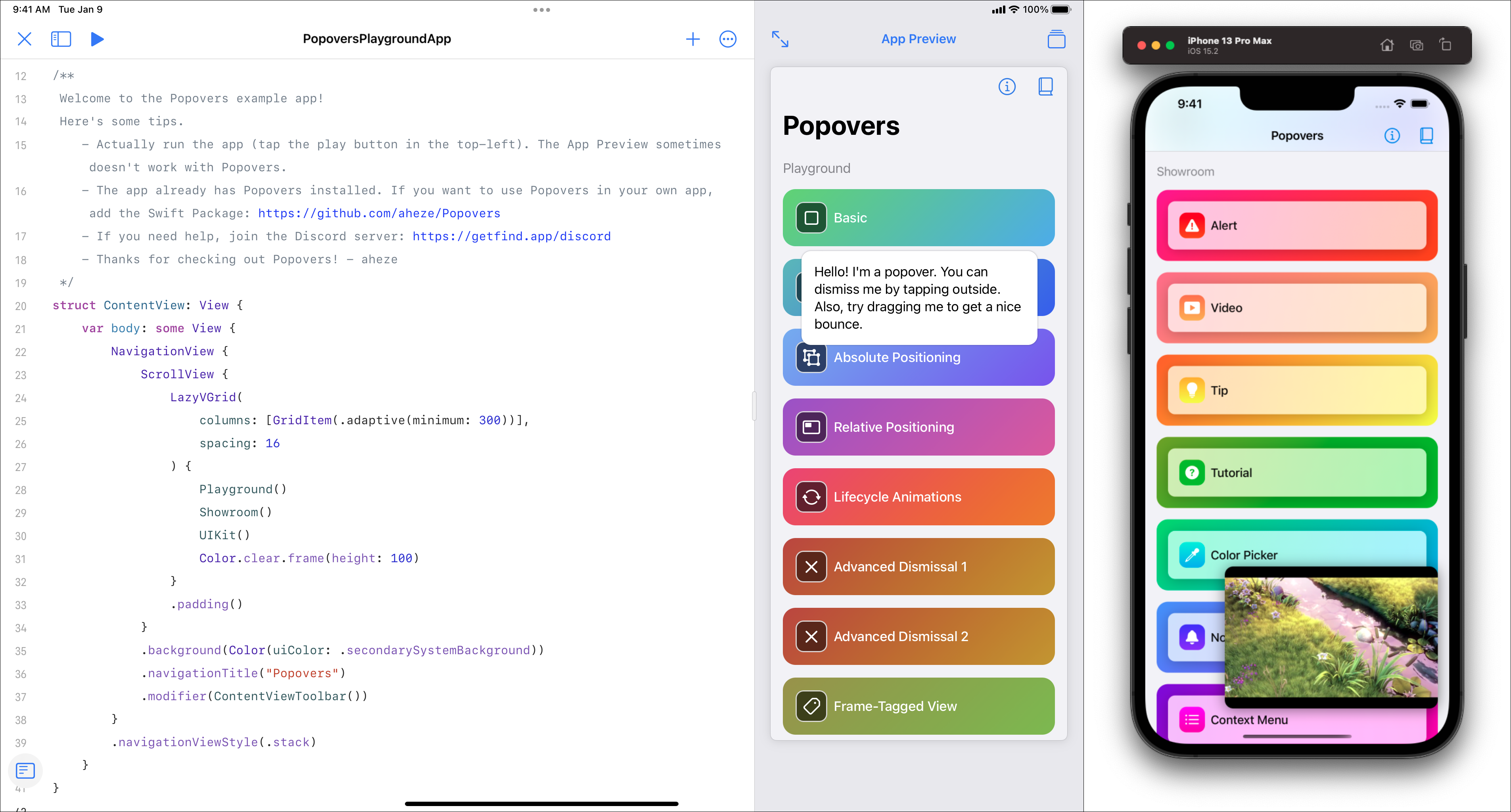
Showroom
| Alert | Color | Menu | Tip | Standard src="https://raw.github.com/aheze/Popovers/main/> |
|
|
|
|
|

|
| Tutorial | Picture-in-Picture | Notification | ||

|

|

|
||
Example
Includes ~20 popover examples. Download
Installation
Requires iOS 13+. Popovers can be installed through the Swift Package Manager (recommended) or Cocoapods.
|
Swift Package Manager
Add the Package URL: |
Cocoapods
Add this to your Podfile: |
|
|
Usage
To present a popover in SwiftUI, use the .popover(present:attributes:view) modifier. By default, the popover uses its parent view as the source frame.
import SwiftUI
import Popovers

struct ContentView: View {
    @State var present = false

    var body: some View {
        Button("Present popover!") {
            present = true
        }
        .popover(present: $present) { /// here!
            Text("Hi, I'm a popover.")
                .padding()
                .foregroundColor(.white)
                .background(.blue)
                .cornerRadius(16)
        }
    }
}
In UIKit, create a Popover instance, then present with UIViewController.present(_:). You should also set the source frame.
import SwiftUI
import Popovers

class ViewController: UIViewController {
    @IBOutlet weak var button: UIButton!
    @IBAction func buttonPressed(_ sender: Any) {
        var popover = Popover { PopoverView() }
        popover.attributes.sourceFrame = { [weak button] in
            button.windowFrame()
        }

        present(popover) /// here!
    }
}

struct PopoverView: View {
    var body: some View {
        Text("Hi, I'm a popover.")
            .padding()
            .foregroundColor(.src="https://raw.github.com/aheze/Popovers/main/)
            .background(.blue)
            .cornerRadius(16)
    }
}

Customization
| 🔖 | 💠 | ⬜ | 🔲 | ⏹ | 🟩 | 🟥 | 🎾 | 🛑 | 👓 | 👉 | 🎈 | 🔰 |
|---|
Customize popovers through the Attributes struct. Pretty much everything is customizable, including positioning, animations, and dismissal behavior.
|
SwiftUI
Configure in the attributes parameter.
|
UIKit
Modify the attributes property.
|
|
|
🔖 Tag • AnyHashable?
Tag popovers to access them later from anywhere. This is useful for updating existing popovers.
/// Set the tag.
$0.tag = "Your Tag"

/// Access it later.
let popover = popover(tagged: "Your Tag") /// Where `self` is a `UIView` or `UIViewController`.

/// If inside a SwiftUI View, use a `WindowReader`:
WindowReader { window in
    let popover = window.popover(tagged: "Your Tag")
}
Note: When you use the .popover(selection:tag:attributes:view:) modifier, this tag is automatically set to what you provide in the parameter.
💠 Position • Position
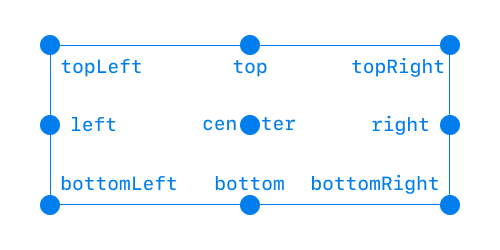
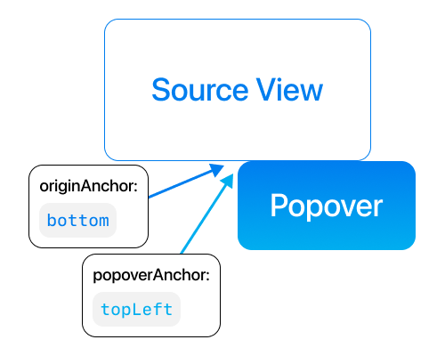
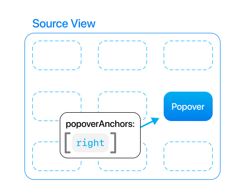
The popover's position can either be .absolute (attached to a view) or .relative (picture-in-picture). The enum's associated value additionally configures which sides and corners are used.
Anchors represent sides and corners.- For
.absolute, provide the origin anchor and popover anchor. - For
.relative, provide the popover anchors. If there's multiple, the user will be able to drag between them like a PIP.
| Anchor Reference | .absolute(originAnchor: .bottom, popoverAnchor: .topLeft) |
.relative(popoverAnchors: [.right]) |
|---|---|---|
 |
 |
 |
⬜ Source Frame • (() -> CGRect)
This is the frame that the popover attaches to or is placed within, depending on its position. This must be in global window coordinates. Because frames are can change so often, this property is a closure. Whenever the device rotates or some other bounds update happens, the closure will be called.
|
SwiftUI
By default, the source frame is automatically set to the parent view. Setting this will override it. |
UIKit
It's highly recommended to provide a source frame, otherwise the popover will appear in the top-left of the screen. |
|
|
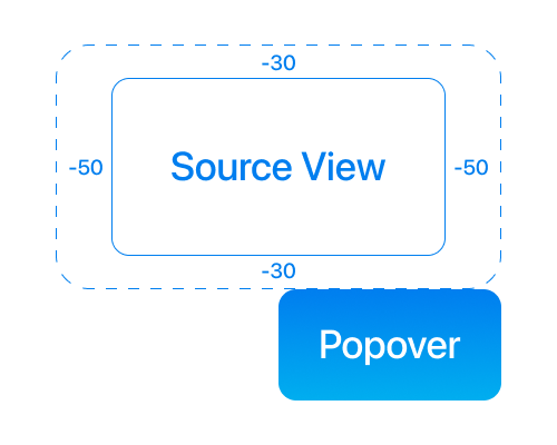
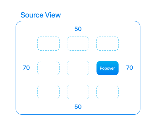
🔲 Source Frame Inset • UIEdgeInsets
Edge insets to apply to the source frame. Positive values inset the frame, negative values expand it.
| Absolute | Relative |
|---|---|
 |
 |
⏹ Screen Edge Padding • UIEdgeInsets
Global insets for all popovers to prevent them from overflowing off the screen. Kind of like a safe area. Default value is UIEdgeInsets(top: 16, left: 16, bottom: 16, right: 16).
🟩 Presentation • Presentation
This property stores the animation and transition that's applied when the popover appears.
/// Default values:
$0.presentation.animation = .easeInOut
$0.presentation.transition = .opacity
🟥 Dismissal • Dismissal
This property stores the popover's dismissal behavior. There's a couple sub-properties here.
/// Same thing as `Presentation`.
$0.dismissal.animation = .easeInOut
$0.dismissal.transition = .opacity

/// Advanced stuff! Here's their default values:
$0.dismissal.mode = .tapOutside
$0.dismissal.tapOutsideIncludesOtherPopovers = false
$0.dismissal.excludedFrames = { [] }
$0.dismissal.dragMovesPopoverOffScreen = true
$0.dismissal.dragDismissalProximity = CGFloat(0.25)
Mode: Configure how the popover should auto-dismiss. You can have multiple at the same time!
.tapOutside- dismiss the popover when the user taps outside it..dragDown- dismiss the popover when the user drags it down..dragUp- dismiss the popover when the user drags it up..none- don't automatically dismiss the popover.
Tap Outside Includes Other Popovers: Only applies when mode is .tapOutside. If this is enabled, the popover will be dismissed when the user taps outside, even when another presented popover is what's tapped. Normally when you tap another popover that's presented, the current one will not dismiss.
Excluded Frames: Only applies when mode is .tapOutside. When the user taps outside the popover, but the tap lands on one of these frames, the popover will stay presented. If you want multiple popovers, you should set the source frames of your other popovers as the excluded frames.
/// Set one popover's source frame as the other's excluded frame.
/// This prevents the the current popover from being dismissed before animating to the other one.

let popover1 = Popover { Text("Hello") }
popover1.attributes.sourceFrame = { [weak button1] in button1.windowFrame() }
popover1.attributes.dismissal.excludedFrames = { [weak button2] in [ button2.windowFrame() ] }

let popover2 = Popover { Text("Hello") }
popover2.attributes.sourceFrame = { [weak button2] in button2.windowFrame() }
popover2.attributes.dismissal.excludedFrames = { [weak button1] in [ button1.windowFrame() ] }
Drag Moves Popover Off Screen: Only applies when mode is .dragDown or .dragUp. If this is enabled,src="https://raw.github.com/aheze/Popovers/main/popover will continue moving off the screen after the user drags.
Drag Dismissal Proximity: Only applies when mode is .dragDown or .dragUp. Represents the point on the screen that the drag must reach in order to auto-dismiss. This property is multiplied by the screen's height.

🎾 Rubber Banding Mode • RubberBandingMode
Configures which axes the popover can "rubber-band" onsrc="https://raw.github.com/aheze/Popovers/main/ dragged. The default is [.xAxis, .yAxis].
.xAxis- enable rubber banding on the x-axis..yAxis- enable rubber banding on the y-axis..none- disable rubber banding.
🛑 Blocks Background Touches • Bool
Set this to true to prevent underlying views from being pressed.

👓 Accessibility • Accessibility • v1.2.0
Popovers is fully accessible! The Accessibility struct provides additional options for how VoiceOver should read out content.
/// Default values:
$0.accessibility.shiftFocus = true
$0.accessibility.dismissButtonLabelsrc="https://raw.github.com/aheze/Popovers/main/faultDismissButtonLabel /// An X icon wrapped in `AnyView?`
Shift Focus: If enabled, VoiceOver will focus the popover as soon as it's presented.
Dismiss Button Label: A button next to the popover that appears when VoiceOver is on. By default, this is an X circle.
 |
|---|
Tip: You can also use the accessibility escape gesture (a 2-fingered Z-shape swipe) to dismiss all popovers.
👉 On Tap Outside • (() -> Void)?
A closure that's called whenever the user taps outside the popover.
🎈 On Dismiss • (() -> Void)?
A closure that's called when the popover is dismissed.
🔰 On Context Change • ((Context) -> Void)?
A closure that's called whenever the context changed. The context contains the popover's attributes, current frame, and other visible traits.
Utilities
| 📘 | 🧩 | 🌃 | 📖 | 🏷 | 📄 |
|---|
Popovers comes with some features to make yoursrc="https://raw.github.com/aheze/Popovers/main/ easier.
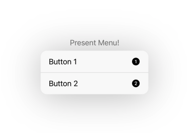
📘 Menus
New in v1.3.0! The template Menu looks and behaves pretty much exactly like the system menu, but also works on iOS 13. It's also extremely customizable with support for manual presentation and custom views.
 |
|---|
SwiftUI (Basic)
struct ContentView: View {
    var body: some View {
        Templates.Menu {
            Templates.MenuButton(title: "Button 1", systemImage: "1.circle.fill") { print("Button 1 pressed") }
            Templates.MenuButton(title: "Button 2", systemImage: "2.circle.fill") { print("Button 2 pressed") }
        } label: { fade in
            Text("Present Menu!")
                .opacity(fade ? 0.5 : 1)
        }
    }
}
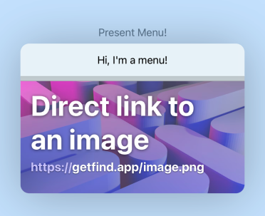
SwiftUI (Customized)
Templates.Menu(
    configuration: {
        $0.width = 360
        $0.backgroundColor = .blue.opacity(0.2)
    }
) {
    Text("Hi, I'm a menu!")
        .padding()

    Templates.MenuDivider()

    Templates.MenuItem {
        print("Item tapped")
    } label: { fade in
        Color.clear.overlay(
            AsyncImage(url: URL(string: "https://getfind.app/image.png")) {
                $0.resizable().aspectRatio(contentMode: .fill)
            } placeholder: {
                Color.clear
            }
        )
        .frame(height: 180)
        .clipped()
        .opacity(fade ? 0.5 : 1)
    }

} label: { fade in
    Text("Present Menu!")
        .opacity(fade ? 0.5 : 1)
}
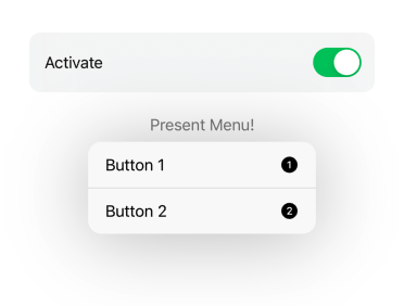
SwiftUI (Manual Presentation)
struct ContentView: View {
    @State var present = false
    var body: some View {
        VStack {
            Toggle("Activate", isOn: $present)
                .padding()
                .background(.regularMaterial)
                .cornerRadius(12)
                .padding()

            Templates.Menu(present: $present) {
                Templates.MenuButton(title: "Button 1", systemImage: "1.circle.fill") { print("Button 1 pressed") }
                Templates.MenuButton(title: "Button 2", systemImage: "2.circle.fill") { print("Button 2 pressed") }
            } label: { fade in
                Text("Present Menu!")
                    .opacity(fade ? 0.5 : 1)
            }
        }
    }
}
UIKit (Basic)
class ViewController: UIViewController {
    @IBOutlet var label: UILabel!

    lazy var menu = Templates.UIKitMenu(sourceView: label) {
        Templates.MenuButton(title: "Button 1", systemImage: "1.circle.fill") { print("Button 1 pressed") }
        Templates.MenuButton(title: "Button 2", systemImage: "2.circle.fill") { print("Button 2 pressed") }
    } fadeLabel: { [weak self] fade in
        self?.label.alpha = fade ? 0.5 : 1
    }

    override func viewDidLoad() {
        super.viewDidLoad()
        _ = menu /// Create the menu.
    }
}
UIKit (Customized)
class ViewController: UIViewController {
    @IBOutlet var label: UILabel!

    lazy var menu = Templates.UIKitMenu(
        sourceView: label,
        configuration: {
            $0.width = 360
            $0.backgroundColor = .blue.opacity(0.2)
        }
    ) {
        Text("Hi, I'm a menu!")
            .padding()

        Templates.MenuDivider()

        Templates.MenuItem {
            print("Item tapped")
        } label: { fade in
            Color.clear.overlay(
                AsyncImage(url: URL(string: "https://getfind.app/image.png")) {
                    $0.resizable().aspectRatio(contentMode: .fill)
                } placeholder: {
                    Color.clear
                }
            )
            .frame(height: 180)
            .clipped()
            .opacity(fade ? 0.5 : 1)
        }
    } fadeLabel: { [weak self] fade in
        UIView.animate(withDuration: 0.15) {
            self?.label.alpha = fade ? 0.5 : 1
        }
    }

    override func viewDidLoad() {
        super.viewDidLoad()
        _ = menu /// Create the menu.
    }
}
UIKit (Manual Presentation)
class ViewController: UIViewController {
    /// ...

    @IBAction func switchPressed(_ sender: UISwitch) {
        if menu.isPresented {
            menu.dismiss()
        } else {
            menu.present()
        }
    }
}
| Basic | Customized | Manual Presentation |
|---|---|---|
 |
 |
 |
🧩 Animating Between Popovers
As long as the view structure is the same, you can smoothly transition from one popover to another.
|
SwiftUI
Use the .popover(selection:tag:attributes:view:) modifier.
|
UIKit
Get the existing popover using UIResponder.popover(tagged:), then call UIResponder.replace(_:with:).
|
|
|
 |
|---|
🌃 Background
You can put anything in a popover's background.
|
SwiftUI
Use the .popover(present:attributes:view:background:)src="https://raw.github.com/aheze/Popovers/main/fier.
|
UIKit
Use the Popover(attributes:view:background:) initializer.
|
|
|

📖 Popover Reader
This reads the popover's context, which contains its frame, window, attributes, and various other properties. It's kind of like GeometryReader, but cooler. You can put it in the popover's view or its background.
.popover(present: $present) {
    PopoverView()
} background: {
    PopoverReader { context in
        Path {
            $0.move(to: context.frame.point(at: .bottom))
            $0.addLine(to: context.windowBounds.point(at: .bottom))
        }
        .stroke(Color.blue, lineWidth: 4)
    }
}
 |
|---|
🏷 Frame Tags
Popovers includes a mechanism for tagging and reading SwiftUI view frames. You can use this to provide a popover's sourceFrame or excludedFrames. Also works great when combined with PopoverReader, for connecting lines with anchor views.
Text("This is a view")
    .frameTag("Your Tag Name") /// Adds a tag inside the window.

/// ...

WindowReader { window in
    Text("Click me!")
    .popover(
        present: $present,
        attributes: {
            $0.sourceFrame = window.frameTagged("Your Tag Name") /// Retrieves a tag from the window.
        }
    )
}
📄 Templates
Get started quickly with some templates. All of them are inside Templates with example usage in the example app.
AlertButtonStyle- a button style resembling a system alert.VisualEffectView- lets you use UIKit blurs in SwiftUI.Container- a wrapper view for theBackgroundWithArrowshape.Shadow- an easier way to apply shadows.BackgroundWithArrow- a shape with an arrow that looks like the system popover.CurveConnector- an animatable shape with endpoints that you can set.Menu- the system menu, but built from scratch.
Notes
State Re-Rendering
If you directly pass a variable down to the popover's view, it might not update. Instead, move the view into its own struct and pass down a Binding.
|
Yes
The popover's view is in a separate struct, with $string passed down.
|
No
The button is directly inside the view parameter and receives string.
|
|
|
Supporting Multiple Screens • v1.1.0
Popovers comes with built-in support for multiple screens, but retrieving frame tags requires a reference to the hosting window. You can get this via WindowReader or PopoverReader's context.
WindowReader { window in

}

/// If inside a popover's `view` or `background`, use `PopoverReader` instead.
PopoverReader { context in
    let window = context.window
}
Popover Hierarchy
Manage a popover's z-axis level by attaching .zIndex(_:) to its view. A higher index will bring it forwards.
Community
| Author | Contributing | Need Help? |
|---|---|---|
| Popovers is made by aheze. | All contributions are welcome. Just fork the repo, then make a pull request. | Open an issue or join the Discord server. You can also ping me on Twitter. Or read the source code — there's lots of comments. |
Apps Using Popovers
Find is an app that lets you find text in real life. Popovers is used for the quick tips and as a replacements for menus — download to check it out!
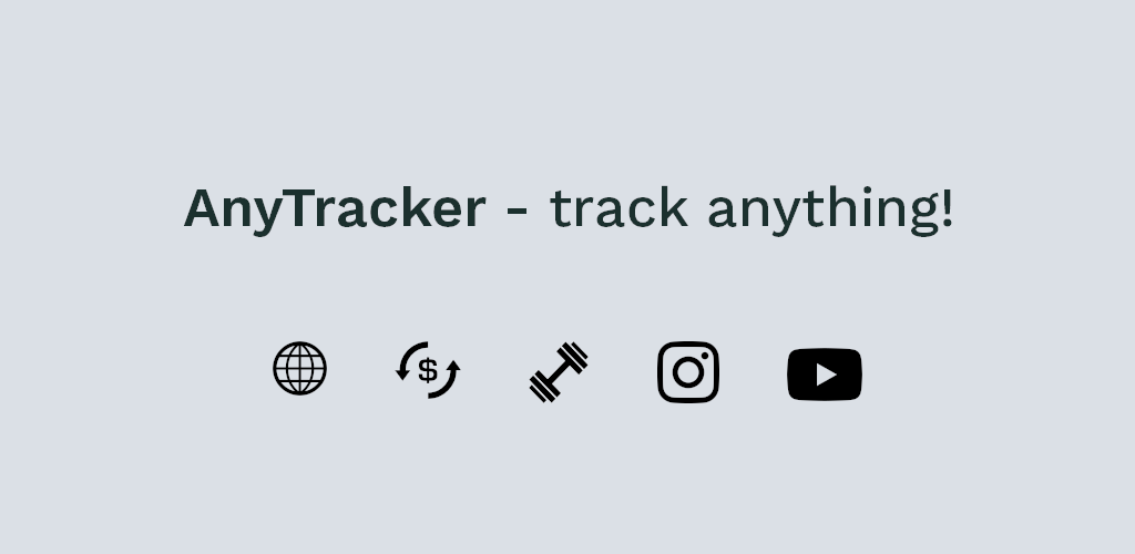
AnyTracker is an app that tracks numbers, text and prices on websites. It uses Popovers to display sleek dialogs with a nice background blur.
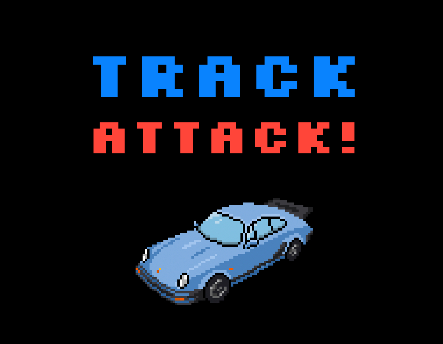
Track Attack! is the ultimate vehicle enthusiast app for the road and track. Modern UI. Dual front & rear cameras. GPS & sensor data. RPM and throttle. Heart rate with Apple Watch. Lap timing for the track & multi-waypoint routing for the road. Easily export and share video with data overlays. Track Attack uses Popovers to display the onboarding tutorial and in-app notifications.
If you have an app that uses Popovers, just make a PR or message me.
License
MIT License

Copyright (c) 2023 A. Zheng

Permission is hereby granted, free of charge, to any person obtaining a copy
of this software and associated documentation files (the "Software"), to deal
in the Software without restriction, including without limitation the rights
to use, copy, modify, merge, publish, distribute, sublicense, and/or sell
copies of the Software, and to permit persons to whom the Software is
furnished to do so, subject to the following conditions:

The above copyright notice and this permission notice shall be included in all
copies or substantial portions of the Software.

THE SOFTWARE IS PROVIDED "AS IS", WITHOUT WARRANTY OF ANY KIND, EXPRESS OR
IMPLIED, INCLUDING BUT NOT LIMITED TO THE WARRANTIES OF MERCHANTABILITY,
FITNESS FOR A PARTICULAR PURPOSE AND NONINFRINGEMENT. IN NO EVENT SHALL THE
AUTHORS OR COPYRIGHT HOLDERS BE LIABLE FOR ANY CLAIM, DAMAGES OR OTHER
LIABILITY, WHETHER IN AN ACTION OF CONTRACT, TORT OR OTHERWISE, ARISING FROM,
OUT OF OR IN CONNECTION WITH THE SOFTWARE OR THE USE OR OTHER DEALINGS IN THE
SOFTWARE.

GitHub
| link |
| Stars: 1799 |
| Last commit: 10 weeks ago |
Related Packages
Release Notes
Finally fixed this really annoying bug.
These 5 lines of code messed up dismissal transitions and animations. Since it's an extension, it even affected apps with Popovers installed even when you didn't import Popovers.
extension Transaction: Equatable {
    public static func == (lhs: Transaction, rhs: Transaction) -> Bool {
        lhs.animation == rhs.animation
    }
}
Fixes #25, #27, and #33.
Swiftpack is being maintained by Petr Pavlik | @ptrpavlik | @swiftpackco | API | Analytics