LabelButtonKit is a mini library for labeled buttons (of SF Symbols), written entirely in SwiftUI. With LabelButtonKit, you'll be able to easily create fully customizable buttons that come with vertical labels as default. But that's not everything. LabelButtonKit fully supports Dynamic Type and transforms the buttons as the Dynamic Type selection increases. Everything adapts and it's shown correctly to your users.
✨ Features
- LabelButtonView: The primary view for this framework. Just call it, pass a LabelButton (your model) and everything works like a charm.
- Quick and Simple: You can fully customize or just pass the SF Symbol string (icon), the text and a backgroundColor. All default implementations provided.
- LabelButtonListView. Want to have it in form of a List? We've got you. Just pass an array of LabelButtons and we create them for you on the fly. Fully adapting them for any case of Accessibility/Dynamic Type.
- Extra View Goodies. This package also comes with some modifiers, components and views that you can freely use.
- Built Swifty and with lightweight in mind.
- 100% Swift.
- Three simple examples are included in the package. All leveraging SwiftUI's power.
- Documented and tested (views were tested with ViewInspector).
- Some aspects of customization include: Icon (SF Symbol string), Text, Text Color, Icon Color, Button Background Color, Color Opacity, Corner Radius, Vertical Padding, Horizontal Padding, Custom Frame and Actions.
🚀 Get Started
Using LabelButtonKit in Production Code
Just import LabelButtonKit:
import LabelButtonKit
Then, you can use it as you please. Like this quick example:
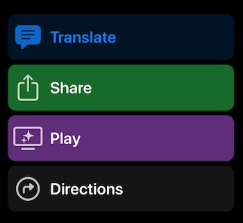
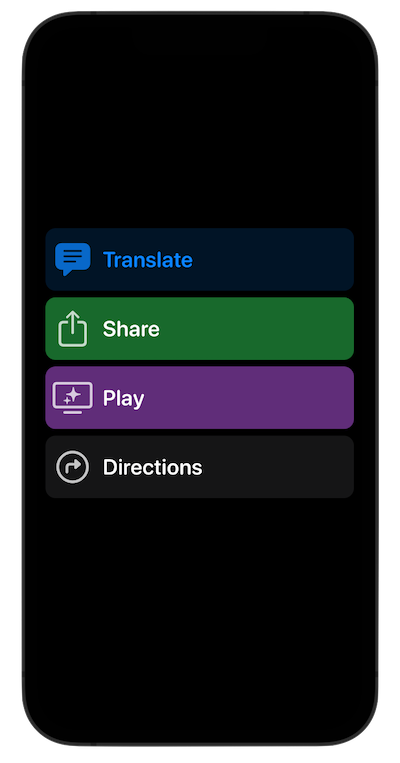
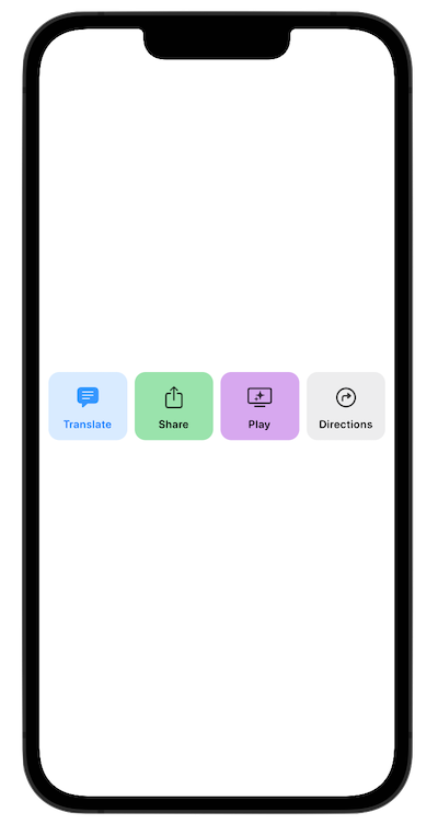
@StateObject var labelButtonModel = LabelButton(icon: "text.bubble.fill", text: "Translate", textColor: .accentColor, iconColor: .accentColor, backgroundColor: .accentColor.opacity(0.15))

var body: some View {
    LabelButtonView(label: labelButtonModel)
}
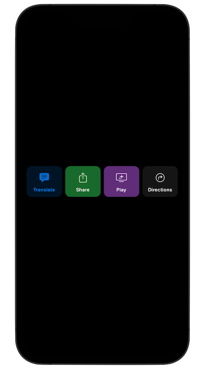
An example using the LabelButtonListView. This is one option:
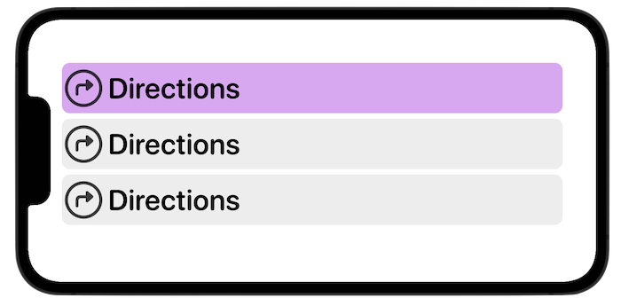
struct SimpleListExampleView: View {

    @State var labelButtons: [LabelButton] = [LabelButton(backgroundColor: .purple.opacity(0.50)), LabelButton(), LabelButton()]

    var body: some View {
        LabelButtonListView(data: labelButtons)
            .padding()
    }

}
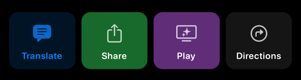
Or, you can also use it making your own stacks and verifying the dynamicTypeSize (no need for the LabelButtonView as it already does):
struct HorizontalStackExampleView: View {
/// This example uses the sizeCategory (dynamicTypeSize) just to show that it can be used outside the LabelButtonListView. LabelButtons already adjust accordingly.
@Environment(\.dynamicTypeSize) var sizeCategory
var needsLargerContent: Bool {
sizeCategory >= .xxLarge
}
var body: some View {
if needsLargerContent {
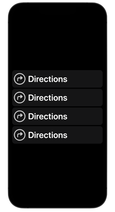
VStack(spacing: 5) {
LabelButtonView(label: LabelButton())
LabelButtonView(label: LabelButton())
LabelButtonView(label: LabelButton())
LabelButtonView(label: LabelButton())
}
} else {
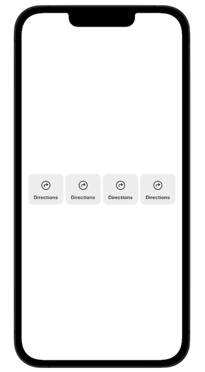
HStack(spacing: 5) {
LabelButtonView(label: LabelButton())
LabelButtonView(label: LabelButton())
LabelButtonView(label: LabelButton())
LabelButtonView(label: LabelButton())
}
.padding()
}
}
}
This package also includes several SwiftUI views that display the types, color and symbols in a stylish way. As well as grids and stacks. You can use these views as you please. Explore 'em all!
📱 Example App for educational purposes
LabelButtonKit also comes with several scenes that you can learn from for how to use types. Such as these and many others:
All examples are located on the Examples folder.
🔨 Swift Package Manager
You can also add this library using Swift Package Manager.
- Go to File > Add Packages.
- The Add Package dialog will appear, by default with Apple packages.
- In the upper right hand corner, paste https://github.com/MarcosAtMorais/LabelButtonKit into the search bar.
- Hit Return to kick off the search.
- Click Add Package.
- You're all set! Just import LabelButtonKit whenever and wherever you want to use it.
🌟 Requirements
iOS 15+
macOS 12+
watchOS 7+
tvOS 14+
GitHub
| link |
| Stars: 5 |
| Last commit: 1 year ago |
Release Notes
This release includes the base LabelButtonKit experience. I hope this package helps you on your project! Thanks!
Swiftpack is being maintained by Petr Pavlik | @ptrpavlik | @swiftpackco | API | Analytics