LNPopupUI
LNPopupUI is a SwiftUI library for presenting views as popups, much like the Apple Music and Podcasts apps.
This is a SwiftUI wrapper of the LNPopupController framework, adapted to work with SwiftUI.


Once a popup bar is presented with a content view, the user can swipe or tap the popup bar at any point to present the content view. After finishing, the user dismisses the popup by either swiping the content view or tapping the popup close button.
The library extends SwiftUI’s View with new functionality for presenting and customizing popups with content views, as well as setting information such as the popup bar’s title, image and bar button items. When a popup bar is presented, the popup bar automatically adapts to the view it was presented on for best appearance.
Generally, it is recommended to present the popup bar on the outermost view, such as TabView or NavigationStack. For example, if you have a view contained in a navigation stack, which is in turn contained in a tab view, it is recommended to present the popup bar on the tab view.
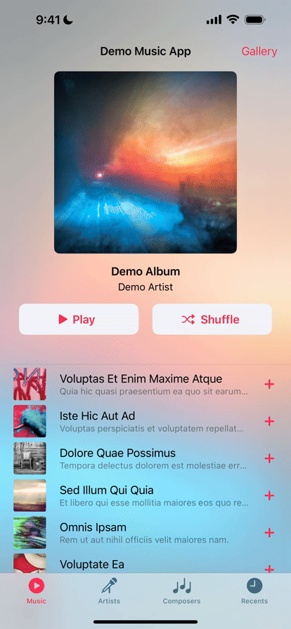
Check the demo project for a quick recreation of Apple’s music app.
Features
- Available for iOS 14 and above, as a SPM package for SwiftUI
- A SwiftUI library, wrapping the LNPopupController framework; the library works internally with SwiftUI’s generated UIKit content to present the framework in a native manner
Adding to Your Project
Swift Package Manager
LNPopupUI supports SPM versions 5.5 (Xcode 13) and above. In Xcode, click File -> Swift Packages -> Add Package Dependency, enter https://github.com/LeoNatan/LNPopupUI. Select the version you’d like to use.
You can also manually add the package to your Package.swift file:
.package(url: "https://github.com/LeoNatan/LNPopupUI.git", from: "1.5.0")
And the dependency in your target:
.target(name: "BestExampleApp", dependencies: ["LNPopupUI"]),
Using the Library
Project Integration
Import the module in your project:
import LNPopupUI
Popups
Popups consist of a popup bar and a popup content view. Information for the popup bar, such as the title, image and bar button items, is configured using the provided modifier APIs.
To present the popup, call the popup(isBarPresented:isPopupOpen:content:) method:
TabView {
	//Top content view
}
.popup(isBarPresented: $isPopupBarPresented, isPopupOpen: $isPopupOpen) {
	PlayerView(song: currentSong)
}
To present and dismiss the popup bar programmatically, toggle the isPopupBarPresented bound var. To open or close the popup programmatically, toggle the isPopupOpen bound var.
For more information, see the documentation in LNPopupUI.swift.
Popup Bar Content
Popup bar content is configured using modifiers of the popup content view.
VStack {
	//Popup content view
}
.popupTitle(song.title)
.popupImage(Image(song.imageName))
.popupProgress(playbackProgress)
.popupBarItems({
	Button(action: {
		isPlaying.toggle()
	}) {
		Image(systemName: "play.fill")
	}

	Button(action: {
		next()
	}) {
		Image(systemName: "forward.fill")
	}
})
Appearance and Behavior
LNPopupUI provides three distinct styles of popup look and feel, each based on Music app looks and feels, that Apple has introduced over the years. Popup bar styles are labeled "floating”, “prominent" and "compact", matching the appropriate Apple style. Popup interaction styles are labeled "snap" for modern style snapping popups and "drag" for iOS 9 interactive popup interaction. Popup close buttons styles are labeled "chevron" for modern style chevron close button and "round" for iOS 9-style close buttons. For each, there is a "default" style for choosing the most suitable one for the current platform and operating system version.
The defaults are:
-
iOS 17:
-
Floating bar style
-
Snap interaction style
-
Chevron close button style
-
No progress view style
-
-
iOS 16 and below:
- Prominent bar style
-
Snap interaction style
-
Chevron close button style
-
No progress view style
You can also present completely custom popup bars. For more information, see Custom Popup Bar View.
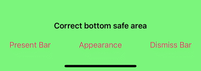
By default, for navigation and tab views, the appearance of the popup bar is determined according to the container’s bottom bar's appearance. For other container views, a default appearance is used, most suitable for src="https://raw.github.com/LeoNatan/LNPopupUI/master/urrent environment.

To disable inheriting the bottom bar’s appearance, call the popupBarInheritsAppearanceFromDockingView() modifier with false.
Bar Style
Customizing the popup bar style is achieved by calling the .popupBarStyle() modifier.
.popup(isBarPresented: $isPopupPresented, isPopupOpen: $isPopupOpen) {
	//Popup content view
}
.popsrc="https://raw.github.com/LeoNatan/LNPopupUI/master/Style(.compact)

Interaction Style
Customizing the popup interaction style is achieved by calling the .popupInteractionStyle() modifier.
.popup(isBarPresented: $isPopupPresented, isPopupOpen: $isPopupOpen) {
	//Popup content view
}
.popupIntsrc="https://raw.github.com/LeoNatan/LNPopupUI/master/ionStyle(.drag)

Progress View Style
Customizing the popup bar progress view style is achieved by calling the .popupBarProgressViewStyle() modifier.
.popup(isBarPresented: $isPopupPresented, isPopupOpen: $isPopupOpen) {
	//Popup content view
}
.popupBarProgressViewStyle(.top)
To hide the progress view, set the bar progressrc="https://raw.github.com/LeoNatan/LNPopupUI/master/w style to .none.

Close Button Style
Customizing the popup close button style is achieved by calling the .popupCloseButtonStyle() modifier.
.popup(isBarPresented: $isPopupPresented, isPopupOpen: $isPopupOpen) {
	//Popup content view
}
.popupCloseButtonStyle(.round)
To hide the popup close button, set the popupClosesrc="https://raw.github.com/LeoNatan/LNPopupUI/master/nStyle to .none.

Text Marquee Scroll
Supplying long text for the title and/or subtitle will result in a scrolling text, if text marquee scroll is enabled. Otherwise, the text will be truncated. To enable text marquee scrolling, use the popupBarMarqueeScsrc="https://raw.github.com/LeoNatan/LNPopupUI/master/nabled() modifier.
Custom Popup Bar View
You can display your own view as the popup bar, instead of the system-provided ones, by using the .popupBarCustomView() modifier.
.popup(isBarPresented: $isPopupPresented, isPopupOpen: $isPopupOpen) {
	//Popup content view
}
.popupBarCustomView(wantsDefaultTapGesture: false, wantsDefaultPanGesture: false, wantsDefaultHighlightGesture: false) {
  //Custom popup bar view content
}
The wantsDefaultTapGesture, wantsDefaultPanGesture and wantsDefaultHighlightGesture arguments control whether the default system gestures of the popup bar shouldsrc="https://raw.github.com/LeoNatan/LNPopupUI/master/nabled or disabled.

The included demo project includes an example custom popup bar scene.
[!TIP] Only implement a custom popup bar view if you need a design that is significantly different than the provided standard popup bar styles. A lot of care and effort has been put into integrating these popup bar styles with the SwiftUI system, including look, feel, transitions and interactions. Custom bars provide a blank canvas for you to implement a bar view of your own, but if you end up recreating a bar design that is similar to a standard bar style, you are more than likely losing subtleties that have been added and perfected over the years in the standard implementations. Instead, consider using the many customization APIs to tweak the standard bar styles to fit your app’s design.
Context Menus
You can add a context menu to your popup bar by calling the .popupBarContextMenu() modifier.
.popup(isBarPresented: $isPopupPresented, isPopupOpen: $isPopupOpen) {
	//Popup content view
}
.popupBarContextMenu {
	Button(action: {
		print("Context Menu Item 1")
	}) {
		Text("Context Menu Item 1")
		Image(systemName: "globe")
	}

	Button(action: {
		print("Context Menu Item 2")
	}) {
		Tesrc="https://raw.github.com/LeoNatan/LNPopupUI/master/ontext Menu Item 2")
		Image(systemName: "location.circle")
	}
}

ProMotion Support
LNPopupUI fully supports ProMotion on iPhone and iPad.
For iPhone 13 Pro and above, you need to add the CADisableMinimumFrameDurationOnPhone key to your Info.plist and set it to true. See Optimizing ProMotion Refresh Rates for iPhone 13 Pro and iPad Pro for more information. LNPopupUI will log a single warning message in the console if this key is missing, or is set to false.
Lower-level Bar Customization
LNPopupUI exposes the .popupBarCustomizer() modifier, which allows lower-level customization through the UIKit LNPopupBar object.
.popup(isBarPresented: $isPopupPresented, isPopupOpen: $isPopupOpen) {
	//Popup content view
}
.popupBarInheritsAppearanceFromDockingView(false)
.popupBarCustomizer { popupBar in
	let paragraphStyle = NSMutableParagraphStyle()
	paragraphStyle.alignment = .right
	paragraphStyle.lineBreakMode = .byTruncatingTail

	popupBar.standardAppearance.backgroundEffect = UIBlurEffect(style: .dark)
	popupBar.standardAppearance.titleTextAttributes = [ .paragraphStyle: paragraphStyle, .font: UIFont(name: "Chalkduster", size: 14)!, .foregroundColor: UIColor.yellow ]
	popupBar.standardAppearance.subtitleTextAttributes = [ .paragraphStyle: paragraphStyle, .font: UIFont(name: "Chalkduster", size: 12)src="https://raw.github.com/LeoNatan/LNPopupUI/master/oregroundColor: UIColor.green ]

	popupBar.tintColor =src="https://raw.github.com/LeoNatan/LNPopupUI/master/low
}


###src="https://raw.github.com/LeoNatan/LNPopupUI/master/l Right-to-Left Support
The library has full righsrc="https://raw.github.com/LeoNatan/LNPopupUI/master/left support.


Acknowledgements
The library uses:
- MarqueeLabel Copyright (c) 2011-2020 Charles Powell
Additionally, the demo project uses:
- LoremIpsum Copyright (c) 2013-2020 Lukas Kubanek
GitHub
| link |
| Stars: 246 |
| Last commit: 5 days ago |
Dependencies
Release Notes
Fixed an issue where custom bar views, created with popupBarCustomView {} would produce excessive padding. (#39, #40)
Swiftpack is being maintained by Petr Pavlik | @ptrpavlik | @swiftpackco | API | Analytics