PageView.SwiftUI

A container view that provides paging with virtualization/lazy loading feature, being implemented purely in SwiftUI using HStack and DragGesture internally.
Since it's a native view from SwiftUI, it supports iOS, iPadOS and macOS.
PageView takes care of the views displaying in the screen, and will discard the views when they are offscreen, which is defined by offscreenCountPerSide.
Users can swipe horizontally to switch pages. You provides pageIndex binding to get or set the current page.
To get more paging info such as paging progress, you pass the onPageTranslationChanged block and you will get noticed when paging translation changed.
NOTE: On iOS, iPadOS and tvOS, if you just need a container view as a navigating root view with swiping to switch pages, you can just use the official
TabViewwith .pageTabViewStyle. However, if you want to display a large amount of data, thisPageViewis for you since it has virtualization/lazy loading feature.
NOTE:
DragGesturedoesn't support Mac's TrackPad, so if you need to support swiping-to-scroll by TrackPad, you must useNSPageControllerto implement this. I make aNSPageViewbased onNSPageController, see https://github.com/JuniperPhoton/MyerLibApple/blob/main/Sources/MyerView/Mac/NSPageView.swift for more.
Import using Swift Package
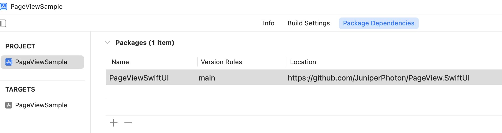
Add as package dependencies in your Xcode, like below.
https://github.com/JuniperPhoton/PageView.SwiftUI
Before using PageView, remember to import:
import PageView
Example
The first look:
PageView(items: items,
         pageIndex: $pageIndex,
         disablePaging: Binding.constant(false), spacing: 8) { item in
    ZStack {
        AsyncImage(...)

        Text(...)
    }
}
The example above achieves the following feature:

The indicator uses the binding pageIndex to update itself:
HStack {
    ForEach(items, id: \.id) { item in
        Circle().fill(Color.white)
            .opacity(items.firstIndex(of: item) == pageIndex ? 1.0 : 0.5)
            .frame(width: 12, height: 12)
    }
}.frame(maxWidth: .infinity, maxHeight: .infinity, alignment: .bottom)
    .padding()
Customization
First please refer to the initializer of the PageView.
- Parameter
items: items to be populated, should be aRandomAccessCollection - Parameter
pageIndex: a binding to the current page index - Parameter
disablePaging: a binding to disable the paging. Set this to true will disable the gesture, you can still set thepageIndexto navigate to the specified page - Parameter
offscreenCountPerSide: effects how many Views will be on screen at the same time. The default value is 2, which makes1 + 2 * 2 = 5views. Youritemscould be as large as you want, and keep thisoffscreenCountPerSidesmall to help reduce your memory footage. - Parameter
spacing: spacing between pages, horizontally. Note that the spacing won't be see until users start swiping - Parameter
scrollSlop: how much pts the user swipe to navigate to the next page, default to 20pt - Parameter
animationDuration: animation duration, default to 0.3 seconds - Parameter
onPageTranslationChanged: when the user start swiping, this block will be invoked to provide information about paging translation. SeePagingTranslationto know more. - Parameter
itemContent: providesViewgiven aC.Elementyou passed in theitems
    public init(items: C,
                pageIndex: Binding<Int>,
                disablePaging: Binding<Bool>,
                offscreenCountPerSide: Int = 2,
                spacing: CGFloat = 20,
                scrollSlop: CGFloat = 20,
                animationDuration: CGFloat = 0.3,
                onPageTranslationChanged: ((PagingTranslation) -> Void)? = nil,
                @ViewBuilder itemContent: @escaping (C.Element) -> Content)
The example of onPageTranslationChanged will output when swiping from page0 to page1. You can use this progress to update your indicator progressively.
app current translation is 0 -> 1, Progress: 0.028837985361502068
app current translation is 0 -> 1, Progress: 0.03816793893129771
app current translation is 0 -> 1, Progress: 0.05173874872028069
app current translation is 0 -> 1, Progress: 0.05597964376590331
app current translation is 0 -> 1, Progress: 0.057675970723004136
app current translation is 0 -> 1, Progress: 0.05937233650654024
app current translation is 0 -> 1, Progress: 0.06446139503071327
app current translation is 0 -> 1, Progress: 0.07803220481969625
app current translation is 0 -> 1, Progress: 0.09499574617575143
app current translation is 0 -> 1, Progress: 0.11535198027244355
app current translation is 0 -> 1, Progress: 0.14079727289330868
app current translation is 0 -> 1, Progress: 0.15521628498727735
app current translation is 0 -> 1, Progress: 0.1798133753031568
app current translation is 0 -> 1, Progress: 0.20610687022900764
app current translation is 0 -> 1, Progress: 0.24173027989821882
app current translation is 0 -> 1, Progress: 1.0
Example
This repo includes an example, please navigate to this to know more.
Limitations
There are some limitations which are about to be resolved(perhaps we don't have enough API to do this):
- Inside the
PageView, you can put a SwiftUIListand it works fine. But if you put aScrollViewwith grids or stacks,PageViewwould take over the gesture and theScrollViewcan't be scrolled. Currently SwiftUI can't handle the conflict of your custom gesture with other built-in views'.
GitHub
| link |
| Stars: 6 |
| Last commit: 43 weeks ago |
Swiftpack is being maintained by Petr Pavlik | @ptrpavlik | @swiftpackco | API | Analytics