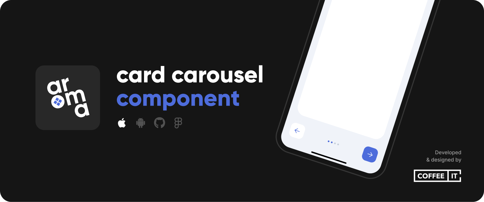
The CITCardsCarousel package provides a configurable arrangement of swipe-able card views which can be used for tutorials and other flows. Includes page insrc="https://raw.github.com/Coffee-IT-Development/CardsCarousel-iOS-Component/main/ors, skip, previous, next and finish buttons.

⚡ Installation
🔨 SwiftPM
To install the Swift Package, go to Project > Package Dependencies > + > Search or Enter Package URL > Fill in:
https://github.com/Coffee-IT-Development/CardsCarousel-iOS-Component
📖 Usage
Import CITCardsCarousel and add a CITCardsCarouselView to your SwiftUI view. The following example showcases how you could use the cards carousel in a sheet or fullScreenCover.
import CITCardsCarousel
import SwiftUI

struct CITCardsCarouselExampleView: View {
    @State private var selectedTab = 0
    @State private var isShowingInSheet = false
    @State private var isShowingFullscreen = false

    var body: some View {
        VStack {
            exampleButton("Show cards carousel fullscreen", action: showCardsCarouselFullscreen)
            exampleButton("Show cards carousel in sheet", action: showCardsCarouselInSheet)
        }
        .fullScreenCover(isPresented: $isShowingFullscreen) {
            cardsCarousel
        }
        .sheet(isPresented: $isShowingInSheet) {
            cardsCarousel
        }
    }

    var cardsCarousel: some View {
        CITCardsCarouselView(selection: $selectedTab, pageCount: 6, config: .coloredExample) {
            card("A").tag(0)
            card("B").tag(1)
            card("C").tag(2)
            card("D").tag(3)
            card("E").tag(4)
            card("F").tag(5)
        }
    }

    private func card(_ name: String) -> some View {
        ZStack {
            Color.white
            Text(name)
        }
    }

    private func exampleButton(_ text: String, action: @escaping () -> Void) -> some View {
        Button(action: action) {
            Text(text)
                .padding()
                .foregroundColor(.carouselButtonTextColor)
                .background(Color.coffeeItColor)
                .cornerRadius(20)
        }
    }

    private func showCardsCarouselFullscreen() {
        selectedTab = 0
        isShowingFullscreen = true
    }

    private func showCardsCarouselInSheet() {
        selectedTab = 0
        isShowingInSheet = true
    }
}
⚙️ Customization
/// The padding around the card container. Defaults to `.init(top: 24, leading: 24, bottom: 32, trailing: 24)`.
public var cardPadding: EdgeInsets

/// The safe area edges that a card ignores. Can be set to `.top` to allow a card to affect status bar area (i.e. let an image or color reach the top of the screen). Defaults to `nil`.
public var cardIgnoreSafeAreaEdges: Edge.Set?

/// The padding around the bottom controls. Defaults to `.init(top: 0, leading: 24, bottom: 24, trailing: 24)`.
public var bottomControlsPadding: EdgeInsets

/// The spacing between the bottom controls. Defaults to `16`.
public var bottomControlsSpacing: CGFloat

/// The height of the navigation buttons. May be used to negate visual glitches if navigation button font size and icon size differ too much, if `nil`, defaults to intrinsic content size.
public var navigationButtonHeight: CGFloat?

/// The padding around the navigation button content. Defaults to `init(top: 16, leading: 16, bottom: 16, trailing: 16)`.
public var navigationButtonContentPadding: EdgeInsets

/// The squared size of navigation button icons, i.e. `xmark`, `arrow.left` and `arrow.right`. Defaults to `20`.
public var navigationButtonIconSize: CGFloat

/// The dismiss icon used in the navigation buttons. Defaults to `xmark`.
public var navigationButtonDismissIcon: Image

/// The previous icon used in the navigation buttons. Defaults to `arrow.left`.
public var navigationButtonPreviousIcon: Image

/// The next icon used in the navigation buttons. Defaults to `arrow.right`.
public var navigationButtonNextIcon: Image

/// The finish text used in the right navigation button on the last page. Defaults to `Let's start`.
public var navigationButtonFinishText: String

/// If `true`, shows navigation buttons at the bottom of the cards carousel. If `false`, hides the navigation buttons.
public var showNavigationButtons: Bool

/// If `true`, shows indicators at the bottom of the cards carousel. If `false`, hides the indicators.
public var showIndicators: Bool

/// If `true`, will allow the user to swipe the cards left and right, if `false`, prevents any swipe interaction.
public var cardsSwipingEnabled: Bool

/// The tint color of all carousel elements if not overidden. Including primary button background color, secondary button text color and indicator color.
public var tintColor: Color

/// The backgroundColor of the carousel view, i.e. the area arround the card.
public var backgroundColor: Color

/// The text color of content within the primary buttons, i.e. the right navigation button. Defaults to `.white`.
public var primaryButtonForegroundColor: Color

/// The background color of primary buttons, i.e. the right navigation button. Defaults to `tintColor`.
public var primaryButtonBackgroundColor: Color?

/// The text color of content within the secondary buttons, i.e. the left navigation button. If `nil`, defaults to `tintColor`.
public var secondaryButtonForegroundColor: Color?

/// The background color of primary buttons, i.e. the left navigation button. Defaults to `primaryButtonTextColor`, which defaults to `white`.
public var secondaryButtonBackgroundColor: Color?

/// The color of active indicators. If `nil`, defaults to `tintColor`.
public var activeIndicatorColor: Color?

/// The color of inactive indicators. If `nil`, defaults to `tintColor` with `0.5 opacity`.
public var inactiveIndicatorColor: Color?

/// The font used for all button texts, i.e. the skip and continue button below the center card.
public var buttonTextFont: Font

/// The corner radius of the card. Defaults to `24`.
public var cardCornerRadius: CGFloat

/// The corner radius of the buttons. Defaults to `16`.
public var buttonCornerRadius: CGFloat

/// The corner radius of the indicators. Defaults to `.infinity` to make them round.
public var indicatorCornerRadius: CGFloat

/// The spacing between indicators. Defaults to `6`.
public var indicatorSpacing: CGFloat

/// The size of each indicator, determines both width and height of circle. Defaults to `6`.
public var indicatorSize: CGFloat

/// The animation of the entire carousel. Defaults to `.default`, but replaced with `nil` during onAppear to prevent visual glitches in `nonSwipeableCards`.
public var carouselAnimation: Animation?
🔗 Related publications
Look at our other repositories on our GitHub account.
✏️ Changelog
All notable changes to this project will be documented in the Changelog.
CITCardsCarousel adheres to Semantic Versioning.
📧 Contact
For questions, ideas or help you can reach us by email at [email protected].
⚠️ License
Distributed under the MIT License. See LICENSE for more information.
GitHub
| link |
| Stars: 8 |
| Last commit: 1 year ago |
Swiftpack is being maintained by Petr Pavlik | @ptrpavlik | @swiftpackco | API | Analytics