CTNotificationContent


A Notification Content Extension class to display custom content interfaces for iOS 10 push notifications
Starting with iOS 10 you can add custom content views to iOS push notifications. This library provides a class to accomplish that. It provides a default Image Slideshow view and is designed to be easily extensible to display additional view types.
Custom push notification content interfaces are enabled in iOS 10 via a Notification Content Extension, a separate and distinct binary embedded in your app bundle.
Table of contents
🎉 Installation
CocoaPods
Your Podfile should look something like this:
source 'https://github.com/CocoaPods/Specs.git'
platform :ios, '10.0'

use_frameworks!

target 'YOUR_NOTIFICATION_CONTENT_TARGET_NAME' do
    pod 'CTNotificationContent'
end
Then run pod install
Swift Package Manager
Swift Package Manager is an Xcode tool that installs project dependencies. To use it to install CTNotificationContent SDK, follow these steps:
- In Xcode, navigate to File -> Swift Package Manager -> Add Package Dependency.
- Enter https://github.com/CleverTap/CTNotificationContent.git when choosing package repo and Click Next.
- On the next screen, Select an SDK version (by default, Xcode selects the latest stable version). Click Next.
- Click Finish and ensure that the CTNotificationContent has been added to the appropriate target.
🚀 Setup
Configure your app for Push and add a Notification Content Extension target
Enable push notifications in your main app.
Create a Notification Content Extension in your project. To do that in your Xcode project, select File -> New -> Target and choose the Notification Content Extension template.

Configure your Notification Content Extension to use the CTNotificationViewController class
Change the superclass of your NotificationViewController to CTNotificationViewController. You should not implement any of the UNNotificationContentExtension protocol methods in your NotificationViewController class, those will be handled by CTNotificationViewController. See Objective-C example here and Swift example here.
Edit the Maininterface.storyboard in your NotificationContent target to a plain UIView, see example here.
In your AppDelegate, register the Notification category and actions:
Swift:
    // register category with actions
    let action1 = UNNotificationAction(identifier: "action_1", title: "Back", options: [])
    let action2 = UNNotificationAction(identifier: "action_2", title: "Next", options: [])
    let action3 = UNNotificationAction(identifier: "action_3", title: "View In App", options: [])
    let category = UNNotificationCategory(identifier: "CTNotification", actions: [action1, action2, action3], intentIdentifiers: [], options: [])
    UNUserNotificationCenter.current().setNotificationCategories([category])
Objective-C:
    UNUserNotificationCenter *center = [UNUserNotificationCenter currentNotificationCenter];
    UNNotificationAction *action1 = [UNNotificationAction actionWithIdentifier:@"action_1" title:@"Back" options:UNNotificationActionOptionNone];
    UNNotificationAction *action2 = [UNNotificationAction actionWithIdentifier:@"action_2" title:@"Next" options:UNNotificationActionOptionNone];
    UNNotificationAction *action3 = [UNNotificationAction actionWithIdentifier:@"action_3" title:@"View In App" options:UNNotificationActionOptionNone];
    UNNotificationCategory *cat = [UNNotificationCategory categoryWithIdentifier:@"CTNotification" actions:@[action1, action2, action3] intentIdentifiers:@[] options:UNNotificationCategoryOptionNone];
    [center setNotificationCategories:[NSSet setWithObjects:cat, nil]];
See Objective-C example here and Swift example here.
Then configure your Notification Content target Info.plist to reflect the category identifier you registered: NSExtension -> NSExtensionAttributes -> UNNotificationExtensionCategory. In addition, set the UNNotificationExtensionInitialContentSizeRatio -> 0.1 and UNNotificationExtensionDefaultContentHidden -> true.
Also, If you plan on downloading non-SSL urls please be sure to enable App Transport Security Settings -> Allow Arbitrary Loads -> true in your plist. See plist example here.
Dashboard Usage
(Back to top) While creating a Push Notification campaign on CleverTap, just follow the steps below -
- On the "WHAT" section pass the desired required values in the "title" and "message" fields (NOTE: These are iOS alert title and body).

- Click on "Advanced" and then click on "Rich Media" and select Single or Carousel template.

- For adding custom key-value pair, add the template Keys individually or into one JSON object and use the
pt_jsonkey to fill in the values.

- Send a test push and schedule!
Template Types
Rich Media
Single Media
Single media is for basic view with single image.

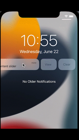
Content Slider
Content Slider is for image slideshow view where user can add multiple images with different captions, sub-captions, and actions.
Custom key-value pair
Basic Template
Basic Template is the basic push notification received on apps where user can also update text colour, background colour.

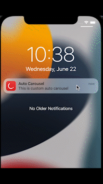
Auto Carousel Template
Auto carousel is an automatic revolving carousel push notification where user can also update text colour, background colour.
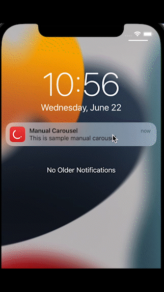
Manual Carousel Template
This is the manual version of the carousel. The user can navigate to the next/previous image by clicking on the Next/Back buttons.
NOTE:
For iOS 12 and above, you need to configure your Notification Content target Info.plist to reflect the category identifier you registered: NSExtension -> NSExtensionAttributes -> UNNotificationExtensionCategory. In addition, set the UNNotificationExtensionInitialContentSizeRatio -> 0.1 , UNNotificationExtensionDefaultContentHidden -> true and UNNotificationExtensionUserInteractionEnabled -> 1.
For iOS 11 and below, the previous/next buttons will not work. Please use notification actions with identifiers action_1 and action_2 for this purpose.
Timer Template
This template features a live countdown timer. You can even choose to show different title, message, and background image after the timer expires.

Zero Bezel Template
The Zero Bezel template ensures that the background image covers the entire available surface area of the push notification. All the text is overlayed on the image.

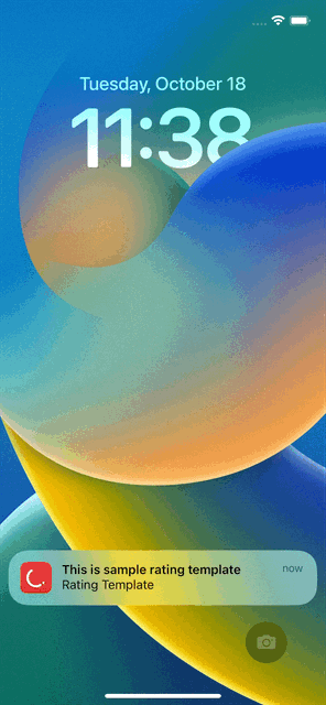
Rating Template
Rating template lets your users give you feedback.
NOTE:
For iOS 12 and above, you need to configure your Notification Content target Info.plist to reflect the category identifier you registered: NSExtension -> NSExtensionAttributes -> UNNotificationExtensionCategory. In addition, set the UNNotificationExtensionInitialContentSizeRatio -> 0.1 , UNNotificationExtensionDefaultContentHidden -> true and UNNotificationExtensionUserInteractionEnabled -> 1.
For iOS 11 and below, it will fallback to a basic template.
Product Catalog Template
Product catalog template lets you show case different images of a product (or a product catalog) before the user can decide to click on the "BUY NOW" option which can take them directly to the product via deep links. This template has two variants.
NOTE:
For iOS 12 and above, you need to configure your Notification Content target Info.plist to reflect the category identifier you registered: NSExtension -> NSExtensionAttributes -> UNNotificationExtensionCategory. In addition, set the UNNotificationExtensionInitialContentSizeRatio -> 0.1 , UNNotificationExtensionDefaultContentHidden -> true and UNNotificationExtensionUserInteractionEnabled -> 1.
For iOS 11 and below, it will fallback to a basic template.
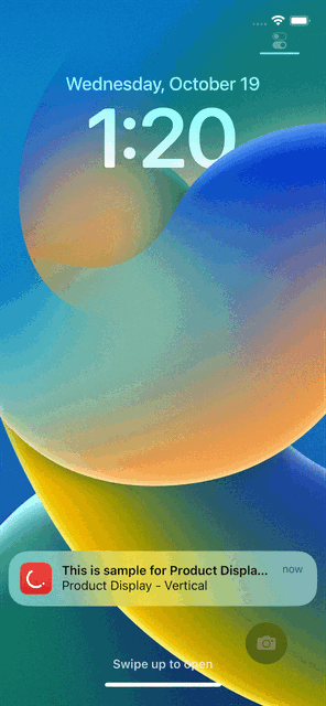
Vertical View
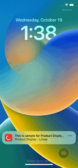
Linear View
Use the following keys to enable linear view variant of this template.
| Template Key | Required | Value |
|---|---|---|
| pt_product_display_linear | Optional | true |
WebView Template
WebView template lets you load a remote https URL.
Note: If any image can't be downloaded, the template falls back to basic template with caption and sub caption only.
Template Keys
Rich Media
Content Slider
Configure your APNS payload:
Then, when sending notifications via APNS:
- include the mutable-content flag in your payload aps entry (this key must be present in the aps payload or the system will not call your app extension)
- for the Image Slideshow view, add the
ct_ContentSliderkey with a json object value, see example below, to the payload, outside of the aps entry.
{

    "aps": {
        "alert": {
            "body": "test message",
            "title": "test title",
        },
        "category": "CTNotification",
        "mutable-content": true,
      },
    "ct_ContentSlider": {
        "orientation": "landscape", // landscape assumes 16:9 images, remove to display default square/portrait images
        "showsPaging": true, // optional to display UIPageControl
        "autoPlay": true, // optional to auto play the slideshow
        "autoDismiss": true, // optional to auto dismiss the notification on item actionUrl launch
        "items":[
            {
                "caption": "caption one",
                "subcaption": "subcaption one",
                "imageUrl": "https://s3.amazonaws.com/ct-demo-images/landscape-1.jpg",
                "actionUrl": "com.clevertap.ctcontent.example://item/one"
            },
            {
                "caption": "caption two",
                "subcaption": "subcaption two",
                "imageUrl": "https://s3.amazonaws.com/ct-demo-images/landscape-2.jpg",
                "actionUrl": "com.clevertap.ctcontent.example://item/two"
            }
       ]
   }
}
Custom key-value pair
Basic Template
| Basic Template Keys | Required | Description |
|---|---|---|
| pt_id | Required | Value - pt_basic |
| pt_title | Required | Title |
| pt_msg | Required | Message |
| pt_msg_summary | Required | Message line when Notification is expanded |
| pt_bg | Required | Background Color in HEX |
| pt_big_img | Optional | Image |
| pt_dl1 | Optional | One Deep Link |
| pt_title_clr | Optional | Title Color in HEX |
| pt_msg_clr | Optional | Message Color in HEX |
| pt_json | Optional | Above keys in JSON format |
Auto Carousel Template
| Auto Carousel Template Keys | Required | Description |
|---|---|---|
| pt_id | Required | Value - pt_carousel |
| pt_title | Required | Title |
| pt_msg | Required | Message |
| pt_msg_summary | Optional | Message line when Notification is expanded |
| pt_dl1 | Required | Deep Link |
| pt_img1 | Required | Image One |
| pt_img2 | Required | Image Two |
| pt_img3 | Required | Image Three |
| pt_bg | Required | Background Color in HEX |
| pt_title_clr | Optional | Title Color in HEX |
| pt_msg_clr | Optional | Message Color in HEX |
| pt_json | Optional | Above keys in JSON format |
Manual Carousel Template
| Manual Carousel Template Keys | Required | Description |
|---|---|---|
| pt_id | Required | Value - pt_manual_carousel |
| pt_title | Required | Title |
| pt_msg | Required | Message |
| pt_msg_summary | Optional | Message line when Notification is expanded |
| pt_dl1 | Required | Deep Link One |
| pt_img1 | Required | Image One |
| pt_img2 | Required | Image Two |
| pt_img3 | Required | Image Three |
| pt_bg | Required | Background Color in HEX |
| pt_title_clr | Optional | Title Color in HEX |
| pt_msg_clr | Optional | Message Color in HEX |
| pt_json | Optional | Above keys in JSON format |
Timer Template
| Timer Template Keys | Required | Description |
|---|---|---|
| pt_id | Required | Value - pt_timer |
| pt_title | Required | Title |
| pt_title_alt | Optional | Title to show after timer expires |
| pt_msg | Required | Message |
| pt_msg_alt | Optional | Message to show after timer expires |
| pt_msg_summary | Optional | Message line when Notification is expanded |
| pt_dl1 | Required | Deep Link |
| pt_big_img | Optional | Image |
| pt_big_img_alt | Optional | Image to show when timer expires |
| pt_bg | Required | Background Color in HEX |
| pt_chrono_title_clr | Optional | Color for timer text in HEX |
| pt_timer_threshold | Required | Timer duration in seconds. Will be given higher priority. |
| pt_timer_end | Optional | Epoch Timestamp to countdown to (for example, $D_1595871380 or 1595871380). Not needed if pt_timer_threshold is specified. |
| pt_title_clr | Optional | Title Color in HEX |
| pt_msg_clr | Optional | Message Color in HEX |
| pt_json | Optional | Above keys in JSON format |
Zero Bezel Template
| Zero Bezel Template Keys | Required | Description |
|---|---|---|
| pt_id | Required | Value - pt_zero_bezel |
| pt_title | Required | Title |
| pt_msg | Required | Message |
| pt_msg_summary | Optional | Message line when Notification is expanded |
| pt_subtitle | Optional | Subtitle |
| pt_big_img | Required | Image |
| pt_dl1 | Required | Deep Link |
| pt_title_clr | Optional | Title Color in HEX |
| pt_msg_clr | Optional | Message Color in HEX |
| pt_json | Optional | Above keys in JSON format |
Rating Template
| Rating Template Keys | Required | Description |
|---|---|---|
| pt_id | Required | Value - pt_rating |
| pt_title | Required | Title |
| pt_msg | Required | Message |
| pt_big_img | Optional | Image |
| pt_msg_summary | Optional | Message line when Notification is expanded |
| pt_subtitle | Optional | Subtitle |
| pt_default_dl | Required | Default Deep Link for Push Notification |
| pt_dl1 | Required | Deep Link for first/all star(s) |
| pt_dl2 | Optional | Deep Link for second star |
| pt_dl3 | Optional | Deep Link for third star |
| pt_dl4 | Optional | Deep Link for fourth star |
| pt_dl5 | Optional | Deep Link for fifth star |
| pt_bg | Required | Background Color in HEX |
| pt_ico | Optional | Large Icon |
| pt_title_clr | Optional | Title Color in HEX |
| pt_msg_clr | Optional | Message Color in HEX |
| pt_json | Optional | Above keys in JSON format |
Product Catalog Template
| Product Catalog Template Keys | Required | Description |
|---|---|---|
| pt_id | Required | Value - pt_product_display |
| pt_title | Required | Title |
| pt_msg | Required | Message |
| pt_subtitle | Optional | Subtitle |
| pt_img1 | Required | Image One |
| pt_img2 | Required | Image Two |
| pt_img3 | Optional | Image Three |
| pt_bt1 | Required | Big text for first image |
| pt_bt2 | Required | Big text for second image |
| pt_bt3 | Required | Big text for third image |
| pt_st1 | Required | Small text for first image |
| pt_st2 | Required | Small text for second image |
| pt_st3 | Required | Small text for third image |
| pt_dl1 | Required | Deep Link for first image |
| pt_dl2 | Required | Deep Link for second image |
| pt_dl3 | Required | Deep Link for third image |
| pt_price1 | Required | Price for first image |
| pt_price2 | Required | Price for second image |
| pt_price3 | Required | Price for third image |
| pt_bg | Required | Background Color in HEX |
| pt_product_display_action | Required | Action Button Label Text |
| pt_product_display_linear | Optional | Linear Layout Template ("true"/"false") |
| pt_product_display_action_clr | Required | Action Button Background Color in HEX |
| pt_title_clr | Optional | Title Color in HEX |
| pt_msg_clr | Optional | Message Color in HEX |
| pt_json | Optional | Above keys in JSON format |
WebView Template
| WebView Template Keys | Required | Description |
|---|---|---|
| pt_id | Required | Value - pt_web_view |
| pt_dl1 | Required | Deep Link |
| pt_url | Required | URL to load |
| pt_orientation | Optional | Value - landscape or portrait |
| pt_json | Optional | Above keys in JSON format |
Sample App
Changelog
(Back to top) Refer to the Change Log.
GitHub
| link |
| Stars: 14 |
| Last commit: Yesterday |
Release Notes
- Fixes a build error related to privacy manifests when statically linking the SDK using Cocoapods.
- Fixes the error "Missing an expected key: 'NSPrivacyCollectedDataTypes'" when generating a privacy report.
- Fixes a location mismatch between the podspec and the privacy manifest location.
Swiftpack is being maintained by Petr Pavlik | @ptrpavlik | @swiftpackco | API | Analytics